

Data Analysis And Visualization – Are You Doing it Right?
There is so much data around us — but it’s mostly facts, numbers, measurements, and a common noise that does not convey any information. Making sense of these facts and numbers require some understanding of analytical methods.
We all need good, actionable, and valuable information. This is why there is an ever-increasing demand for data analysis. Almost any person who has ever touched a computer, at some point, has had to analyze and visualize data in order to present it to others.
It is well worth knowing the basics, to be able to apply and display your data correctly and get the results you want.
Four Basic Methods of Visual Data Analysis
Unless you are a statistician or a data-analyst, you are most likely using only the two, most commonly used types of data analysis: Comparison or Composition. But there are four basic methods of data analysis that can help you turn your numbers into knowledge:
- Comparison
- Composition
- Distribution
- Relationship
1. Comparison
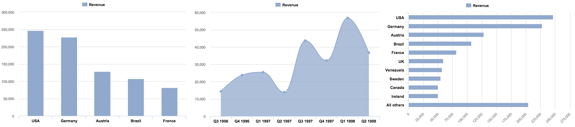
Comparison of data points is probably the most common and easy-to-understand method for data analysis. As the name suggests, we use comparison to evaluate and compare values between two or more data points. With comparison you can also easily find the lowest and highest values in the chart.
There is a common subset of comparison charts—Trends. Trend charts usually have a time axis and one or several value axes, which are used to show how a data set performed during a specific time period (imagine the stock market).
Usually comparisons are made to accomplish one of the following goals:
- To compare two or more values side by side to visually grasp the difference
- To list key values to quickly find and read them (i.e., revenue per month)
- To rank several data categories from best to worst or the other way around
- To show pattern recognition by visually highlighting gaps, spikes, outliers, or trends
You can use data comparison charts to show:
- Annual revenues for major product lines from the previous year, to see which products are performing best and which are failing.
- Total number of visitors per month, grouped by the type of acquisition source, to see where most visitors come from and where to put more efforts.
- Quarterly product sales (in units sold or revenue) for a particular product, to spot seasonal trends or performance issues.
- Number of asthma patients by city, highlighting the environmental effects and increased risks of childhood asthma.
Best chart types to use for data comparisons include:
- Column
- Bar
- Line or time-line
2. Composition
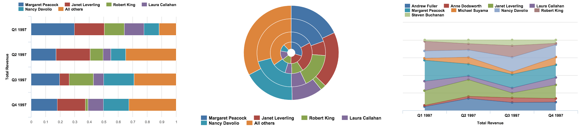 Composition of data is probably the most misused method in data representation endeavors.
The idea is to show how individual parts make up the whole by combining them together and displaying them as a sum. Composition can also be used to show how a total value can be divided into parts or to highlight the significance of each part relative to the total value.
A typical misuse of this presentation type is done when there are too many parts, too many composition sets, the value differences between parts are too big, or any combination of this.
Use data composition charts to show
- Company market share and a few key players in the market
- Total country population by TOP religions, languages, or ethnical groups
- Total revenue, by TOP product lines, divisions, or regions
Charts typically used for compositions include:
- Stacked bars or columns
- Pie or donut charts
- Stacked area charts
- Waterfall charts
Quite a few people would argue that you should not use pie or donut charts because people are bad at evaluating angles. Some would say that you should avoid stacked area charts and waterfall charts because those are confusing and are often misunderstood.
3. Distribution
![]() A distribution combines the merits and functionality of both Comparison and Composition. It can help you see the full data spectrum and visualize related or unrelated data points. With distribution you can see if there are any correlations, trends, patterns, shapes, clusters, averages, or outliers.
A distribution combines the merits and functionality of both Comparison and Composition. It can help you see the full data spectrum and visualize related or unrelated data points. With distribution you can see if there are any correlations, trends, patterns, shapes, clusters, averages, or outliers.
A very common subset of distribution analysis often used in business reporting is Deviation or Variance analysis. These methods let you see which values deviate from the norm. Understanding deviations from targets, budgets, or growth rates is a common requirement in almost any company.
Use a distribution or deviation visualizations chart to:
- Visualize the distribution of ages in a group of people
- Visualize the correlations between cause and effect
- Spot bugs or constraints in production or quality control systems
- Visualize sales in various stores, to spot best and worst performing ones
Charts typically used for Distribution and Deviation:
- Column and bar histogram charts
- Line and area charts
- Scatter plot charts
- Data tables
- Map charts
4. Relationship
![]() As the name suggests, these types of charts show the relationship, correlation, or connection of two or more variables and their properties.
As the name suggests, these types of charts show the relationship, correlation, or connection of two or more variables and their properties.
A good use of relationship graphs would be to demonstrate how something does or does not affect another variable positively or negatively. Somewhat similarly to distribution, you can use data relationships to find correlations, trends, patterns, clusters, averages, or outliers.
Use a relationship chart to:
- Estimate how marketing expenditures affect sales and profit.
- Spot flaws in effectiveness by evaluating expenses vs. income by store or region.
- Answer questions such as, “Does income level depend on IQ?” or “Do top tier business school graduates earn more in their careers?”
Charts typically used for relationship charts:
- Scatter plot (typically with two dimensions)
- Bubble (three to four dimensions, using bubble size and color scale, or five dimensions with animation or layers)
- Line (or lines, with two or more axes)
- Table charts
Picking The Right Chart Type
For different methods of analysis there are different types of charts that work best. For example, bar charts are good for comparisons, while line charts work better for trends and relationships. Scatter plot charts are good for relationships and distributions, but pie charts should be used only for simple compositions—never for comparisons or distributions.
There are some overlaps. The final choice of chart type depends on a few more factors:
- How many variables do you want to show in a single chart? One, two, three, many?
- How many items (data points) will you display for each variable? Only a few or many?
- Will you display values over a period of time, or among items or groups?
To help you pick the right chart for your data type, refer to a chart selection diagram created by Dr. Andrew Abela.
You can download the PDF version here: Chart selection diagram

Recommended Books on Data Analysis
 |
How to Lie with Statistics by Darrel Huff, October 1993 |
 |
Turning Numbers into Knowledge: Mastering the Art of Problem Solving by Jonathan G. Koomey PhD, April 2008. |
 |
Advanced Presentations by Design: Creating Communication that Drives Action by Andrew Abela, September 2008 |