
Data Visualization – How to Pick the Right Chart Type?
Making sense of facts, numbers, and measurements is a form of art – the art of data visualization. There is a load of data in the sea of noise. To turn your numbers into knowledge, your job is not only to separate noise from the data but also to present it the right way.
What is Data Visualization and Why Does it Matter?
Data Visualization is a way of representing data graphically to help people easily understand the information. It can be used to convey complex relationships between different variables or to analyze trends over time. Data visualization can take the form of charts, graphs, maps, histograms, scatter plots, and other visuals. By using colors, shapes, and other visual elements, data visualization can make it easier for people to comprehend large amounts of data quickly and accurately.
Data Visualization is a powerful tool for exploring data, identifying patterns and trends, and communicating insights. It can provide insight into correlations and trends that may otherwise be difficult to detect from examining raw data alone. It is why data visualization tools and methods are often used in business, financial analysis, project management, scientific studies, and just about everywhere else – as long as there is some data to visualize.
Data Visualization Gone Wrong
 Many of us come from the "PowerPoint generation" — this is where the roots of our understanding of data visualization and presentation lie. Unfortunately, it is far from anything related to good, and I stand before you as guilty myself.
And if you think I'm too cynical about this, don't take only my word for it.
PowerPoint could be the most powerful tool on your computer. But it’s not. Countless innovations fail because their champions use PowerPoint the way Microsoft wants them to, instead of the right way.
– Seth Godin, Marketing expert
There is no question that PowerPoint has been at least a part of the problem because it has affected a generation. It should have come with a warning label and a good set of design instructions back in the ’90s. But it is also a copout to blame PowerPoint — it is just software, not a method.
– Garr Reynolds, Presentation expert
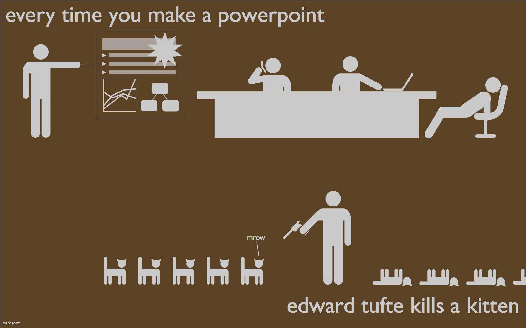 – Mark Goetz

To avoid common pitfalls in your presentations, it wouldn’t hurt to review the basics of data visualization.
In this article, I’ll try to undo some of the damage by sharing some of the best practices for data visualization and representation and, hopefully, save some kittens in the process.
This is a lengthy article, so here's a list of topics that we'll cover:
- Data Visualization Best Practices
- When to use plain tables
- How to use column charts
- When to use bar charts
- How to use line charts
- How to use area charts
- Why avoid pie charts and donut charts
- Propper use of scatter charts
- How to use map charts
- How to use Gantt charts
- Using gauge charts for KPIs
- Should you use multi-axes charts
- Data Visualization Do’s and Don’ts
Data Visualization Best Practices
There are four basic presentation types that you can use to present your data:
- Comparison
- Composition
- Distribution
- Relationship
Unless you are a statistician or a data analyst, you are most likely using only the two, most commonly used types of data analysis: Comparison or Composition.
Selecting the Right Chart
To determine which chart is best suited for each of those presentation types, first, you must answer a few questions:
- How many variables do you want to show in a single chart? One, two, three, many?
- How many items (data points) will you display for each variable? Only a few or many?
- Will you display values over a period of time, or among items or groups?
Bar charts are good for comparisons, while line charts work better for trends. Scatter plot charts are good for relationships and distributions, but pie charts should be used only for simple compositions — never for comparisons or distributions.
There is a chart selection diagram created by Dr. Andrew Abela that should help you pick the right chart for your data type. (You can download the PDF version here: Chart Selection diagram.)

Let’s dig in and review the most commonly used chart types, some examples, and the dos and don’ts for each chart type.
Tables
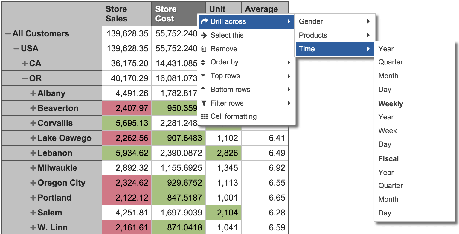
Tables are essentially the source for all the charts. They are best used for comparison, composition, or relationship analysis when there are only a few variables and data points. It would not make much sense to create a chart if the data can be easily interpreted from the table.
Use tables when:
- You need to compare or look up individual values.
- You require precise values.
- Values involve multiple units of measure.
- The data has to communicate quantitative information, but not trends.
Use charts when the data presentation:
- Is used to convey a message that is contained in the shape of the data.
- Is used to show a relationship between many values.
For example, if you want to show the rate of change, like a sudden drop in temperature, it is best to use a chart that shows the slope of a line because the rate of change is not easily grasped from a table.
Column Charts
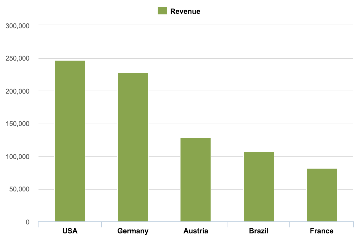
The column chart is probably the most used chart type. This chart is best used to compare different values when specific values are important, and it is expected that users will look up and compare individual values between each column.
With column charts, you could compare values for different categories or compare value changes over a period of time for a single category.
Best practices for column charts
- Use column charts for comparison if the number of categories is quite small — up to five, but not more than seven categories.
- If one of your data dimensions is time — including years, quarters, months, weeks, days, or hours — you should always set the time dimension on the horizontal axis.
- In charts, time should always run from left to right, never from top to bottom.
- For column charts, the numerical axis must start at zero. Our eyes are very sensitive to the height of columns, and we can draw inaccurate conclusions when those bars are truncated.
- Avoid using pattern lines or fills. Use a border only for highlights.
- Only use column charts to show trends if there are a reasonably-low number of data points (less than 20) and if every data point has a clearly-visible value.
Column Histograms
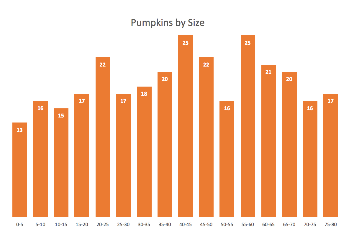
A histogram is a common variation of column charts used to present the distribution and relationships of a single variable over a set of categories. A good example of a histogram would be a distribution of grades on a school exam or the sizes of pumpkins, divided by size group, in a pumpkin festival.
Stacked Column Charts
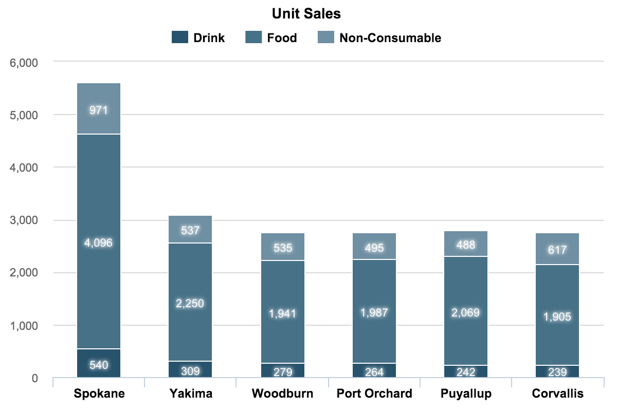
Use stacked column charts to show a composition. Do not use too many composition items (not more than three or four) and make sure the composing parts are relatively similar in size. It can get messy very quickly.
Before moving to the next chart type, I wanted to show you a good example of how to improve the effectiveness of your column chart by simplifying it.
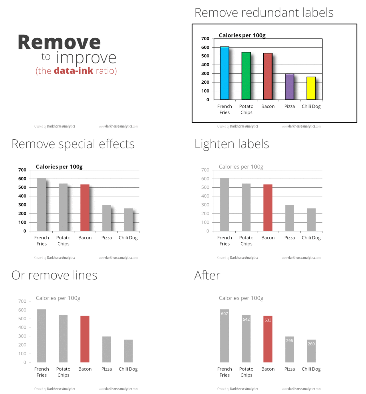
Credit: Joey Cherdarchuk
Bar Charts
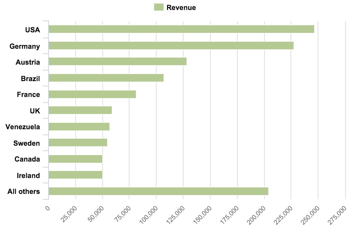
Bar charts are essentially horizontal column charts.
If you have long category names, it is best to use bar charts because they give more space for long text. You should also use bar charts, instead of column charts, when the number of categories is greater than seven (but not more than fifteen) or for displaying a set with negative numbers.
- A typical use of bar charts would be visitor traffic from top referral websites. Referring sites are usually more than five to seven sites and website names are quite long, so those should be better horizontally graphed.
- Another example could be sales performance by sales representatives. Again, names can be quite long, and there might be more than seven sales reps.
Bar Histogram Charts
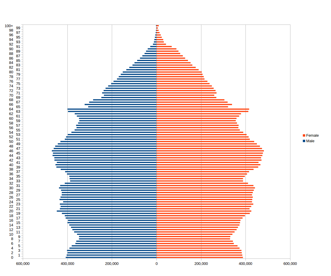
Just like column charts, bar charts can be used to present histograms.
- A good histogram example is a population distribution by the age (and sex). Remember those Christmas-tree graphs?
Stacked Bar Charts
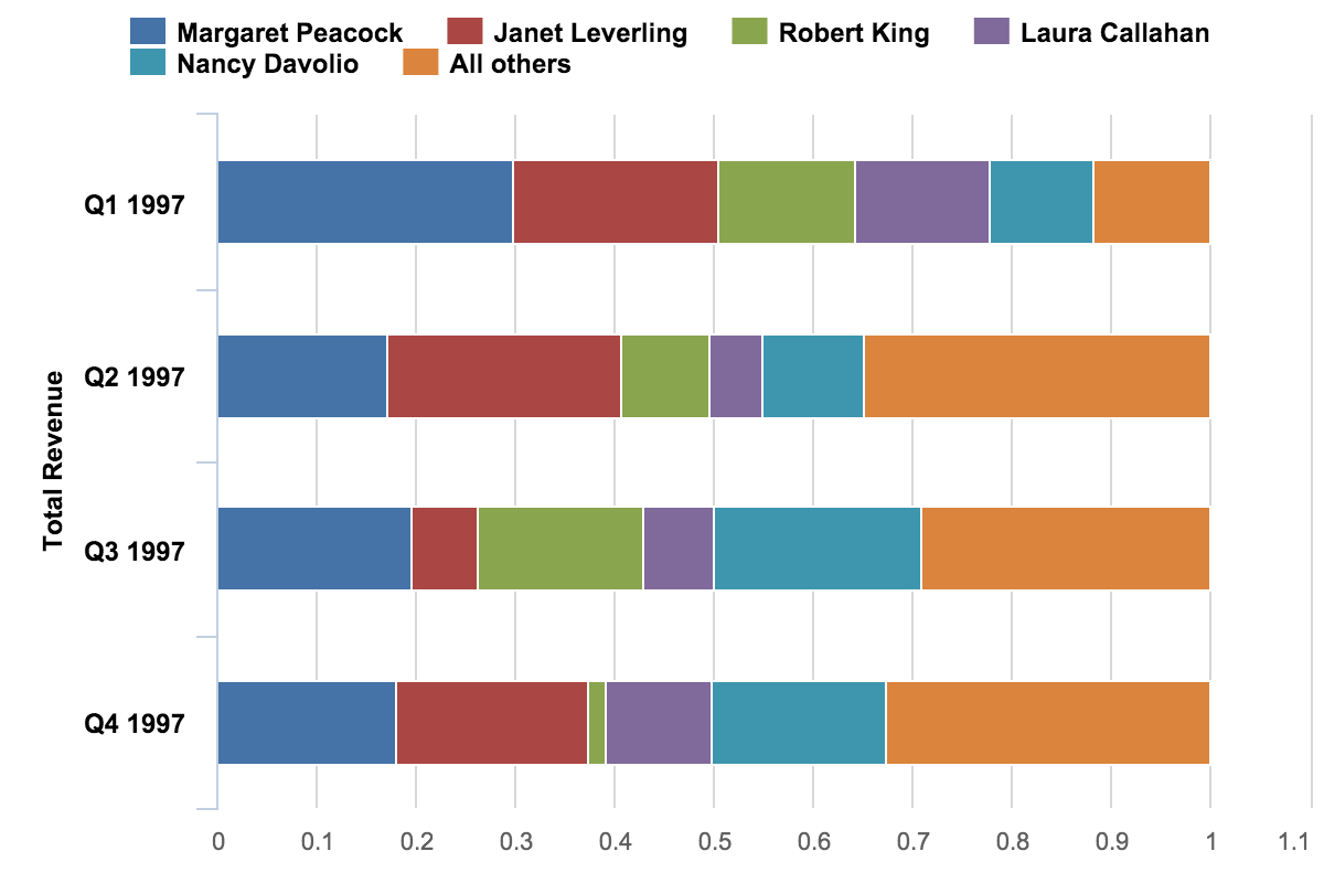
I’m not quite sure about a good application of stacked bar charts — except when there are only a few variables, composition parts, and the emphasis is on composition, not comparison.
Stacked bars are not good for comparison or relationship analysis. The only common baseline is along the left axis of the chart, so you can only reliably compare values in the first series and for the sum of all series.
Line Charts
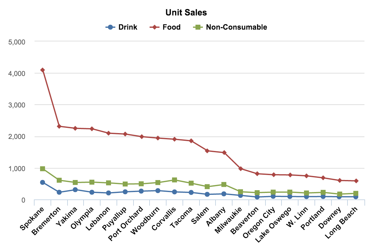
Who doesn’t know line charts? We used to draw those on blackboards in school.
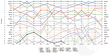
Line charts are among the most frequently used chart types. Use lines when you have a continuous data set. These are best suited for trend-based visualizations of data over a period of time, when the number of data points is very high (more than 20).
With line charts, the emphasis is on the continuation or the flow of the values (a trend), but there is still some support for single value comparisons, using data markers (only with less than 20 data points.)
A line chart is also a good alternative to column charts when the chart is small.
Timeline Charts
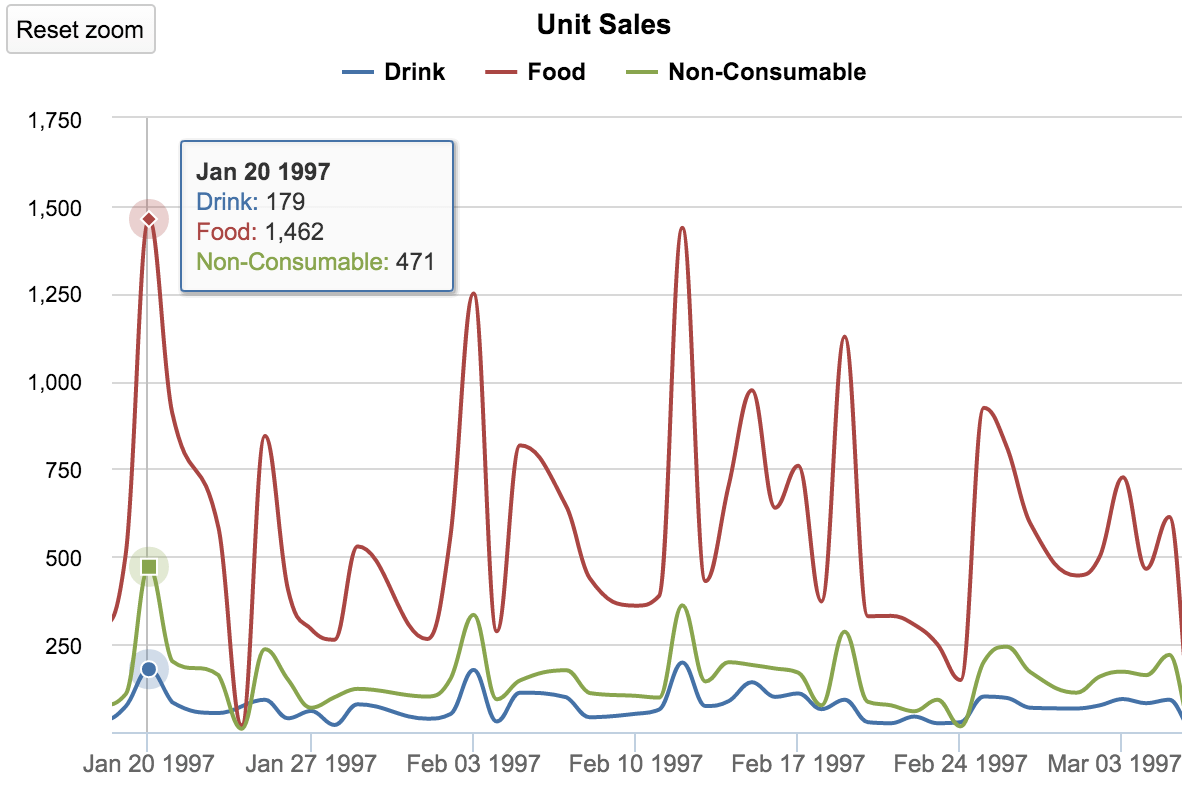
The timeline chart is a variation of line charts. Obviously, any line chart that shows values over a period of time is a timeline chart. The only difference is in functionality — most timeline charts will let you zoom in and out and compress or stretch the time axis to see more details or overall trends.
The most common examples of a time-line chart might be:
- stock market price changes over time,
- website visitors per day for the past 30 days,
- sales numbers by day for the previous quarter.
The Dos and Don’ts for Line Charts
- Use lines to present continuous data in an interval scale, where intervals are equal in size.
- For line charts, the axis may not start from zero if the intended message of the chart is the rate of change or overall trend, not exact values or comparison. It’s best to start the axis with zero for wide audiences because some people may otherwise interpret the chart incorrectly.
- In line charts, time should always run from left to right.
- Do not skip values for consistent data intervals presenting trend information, for example, certain days with zero values.
- Remove guidelines to emphasize the trend, rate of change, and to reduce distraction.
- Use a proper aspect ratio to show important information and avoid dramatic slope effects. For the best perception, aim for a 45-degree slope
Area Charts
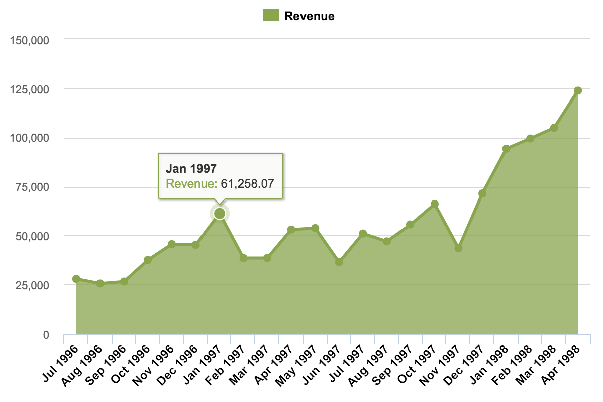
An area chart is essentially a line chart — good for trends and some comparisons. Area charts will fill up the area below the line, so the best use for this type of chart is for presenting accumulative value changes over time, like item stock, number of employees, or a savings account.
Do not use area charts to present fluctuating values, like the stock market or prices changes.
Stacked Area
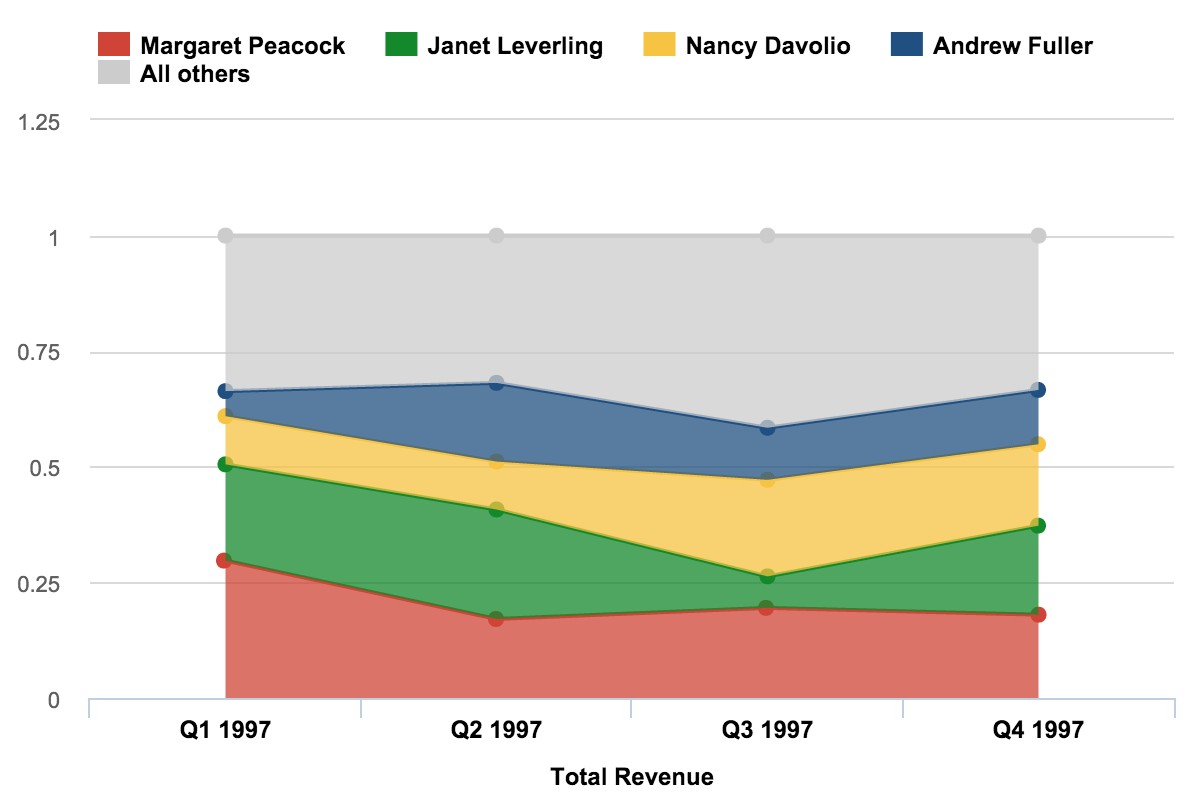
Stacked area charts are best used to show changes in composition over time. A good example would be the changes of market share among top players or revenue shares by product line over a period of time.
Stacked area charts might be colorful and fun, but you should use them with caution, because they can quickly become a mess. Don’t use them if you need an exact comparison and don’t stack together more than three to five categories.
Pie Charts and Donut Charts
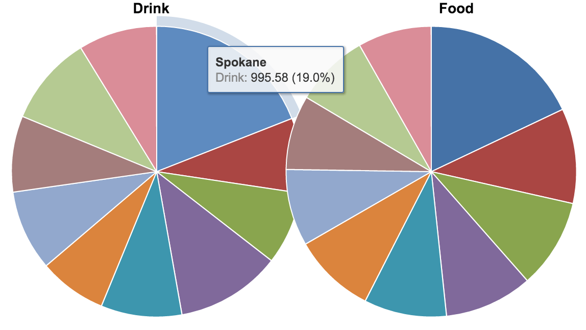
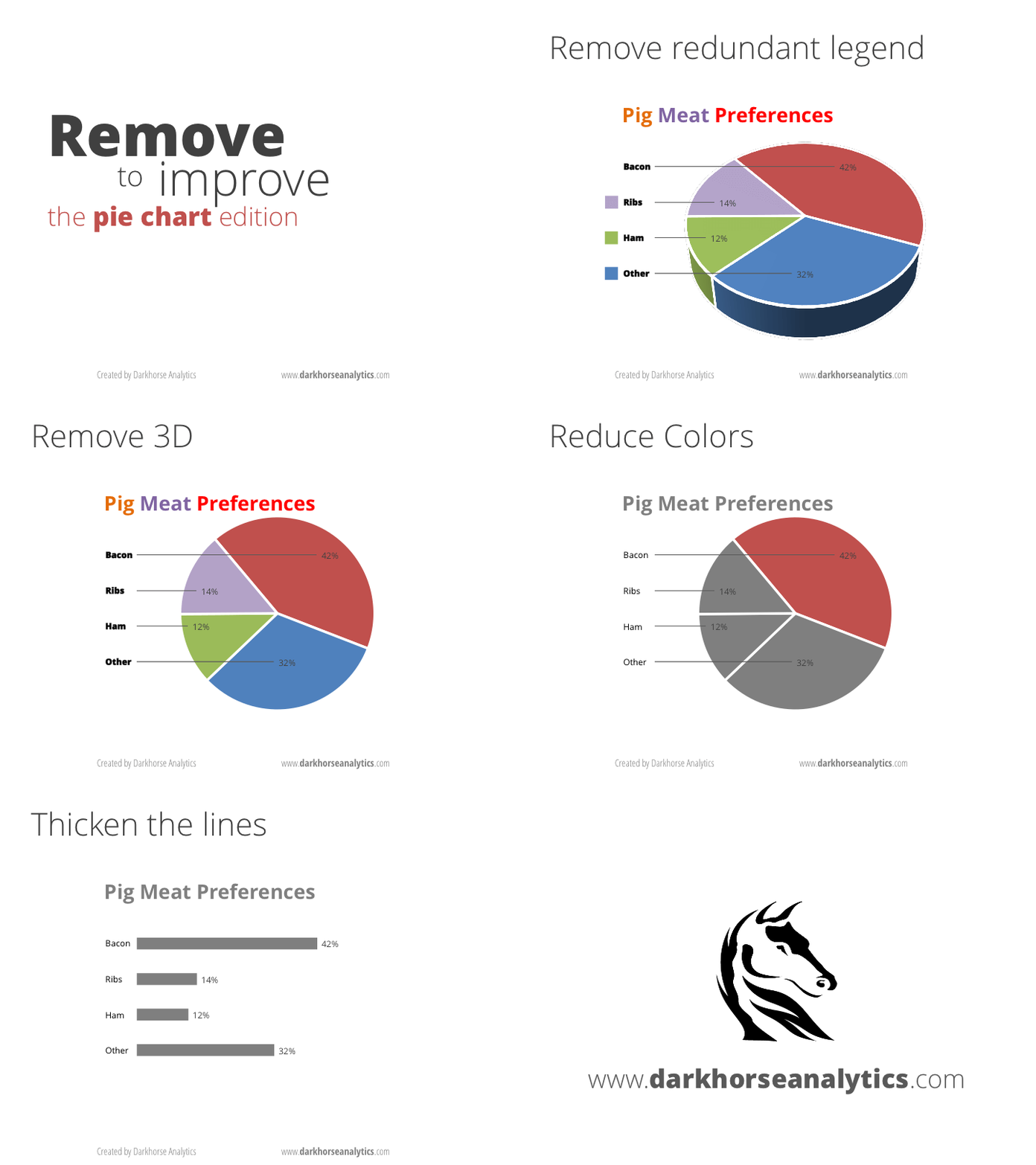
Who doesn’t love pies or donuts, right? Not in data visualization, though. These charts are among the most frequently used and also misused charts. The one above is a good example of a terrible, useless pie chart - too many components, very similar values.
A pie chart typically represents numbers in percentages, used to visualize a part to whole relationship or a composition. Pie charts are not meant to compare individual sections to each other or to represent exact values (you should use a bar chart for that).
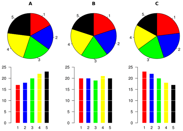
When possible, avoid pie charts and donuts. The human mind thinks linearly but, when it comes to angles and areas, most of us can’t judge them well.
Stacked Donut Charts
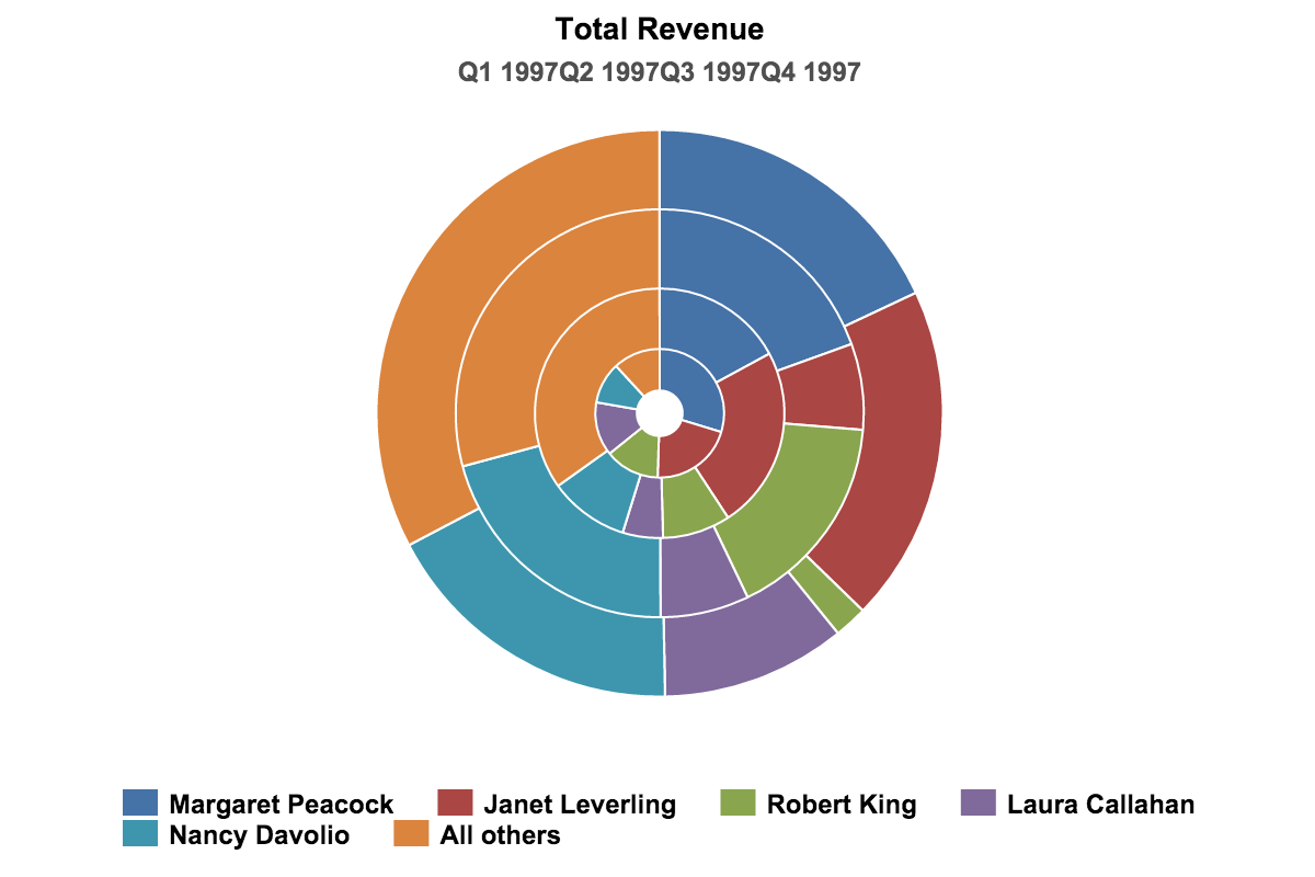
I would not recommend using stacked donut charts at all! I mean, like, never! You might think that you could use a stacked donut to present composition, while allowing some comparison (with an emphasis on composition), but it would perform badly for both. Use stacked column charts instead.
Here’s a good example of how to use pie chart effectively.
 Credit: Joey Cherdarchuk
The Dos and Don’ts for Pie charts
For those of you who still feel sentimental about the old PowerPoint Pie charts, and want to keep using them, there are some things to keep in mind.
- Make sure that the total sum of all segments equals 100 percent.
- Use pie charts only if you have less than six categories, unless there’s a clear winner you want to focus on.
- Ideally, there should be only two categories, like men and women visiting your website, or only one category, like a market share of your company, compared to the whole market.
- Don’t use a pie chart if the category values are almost identical or completely different. You could add labels, but that’s a patch, not an improvement.
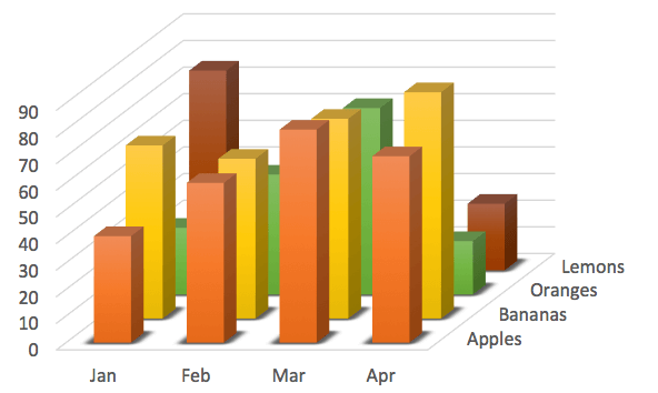
- Don’t use 3D or blow apart effects — they reduce comprehension and show incorrect proportions.
Scatter Charts
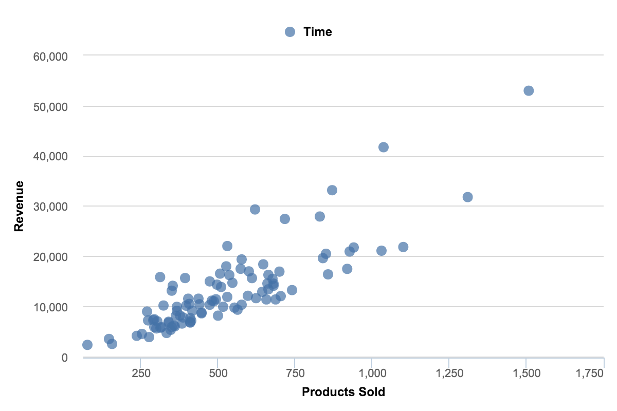
Scatter charts are primarily used for correlation and distribution analysis. Good for showing the relationship between two different variables where one correlates to another (or doesn’t).
Scatter charts can also show the data distribution or clustering trends and help you spot anomalies or outliers.
A good example of scatter charts would be a chart showing marketing spending vs. revenue.
Bubble Charts
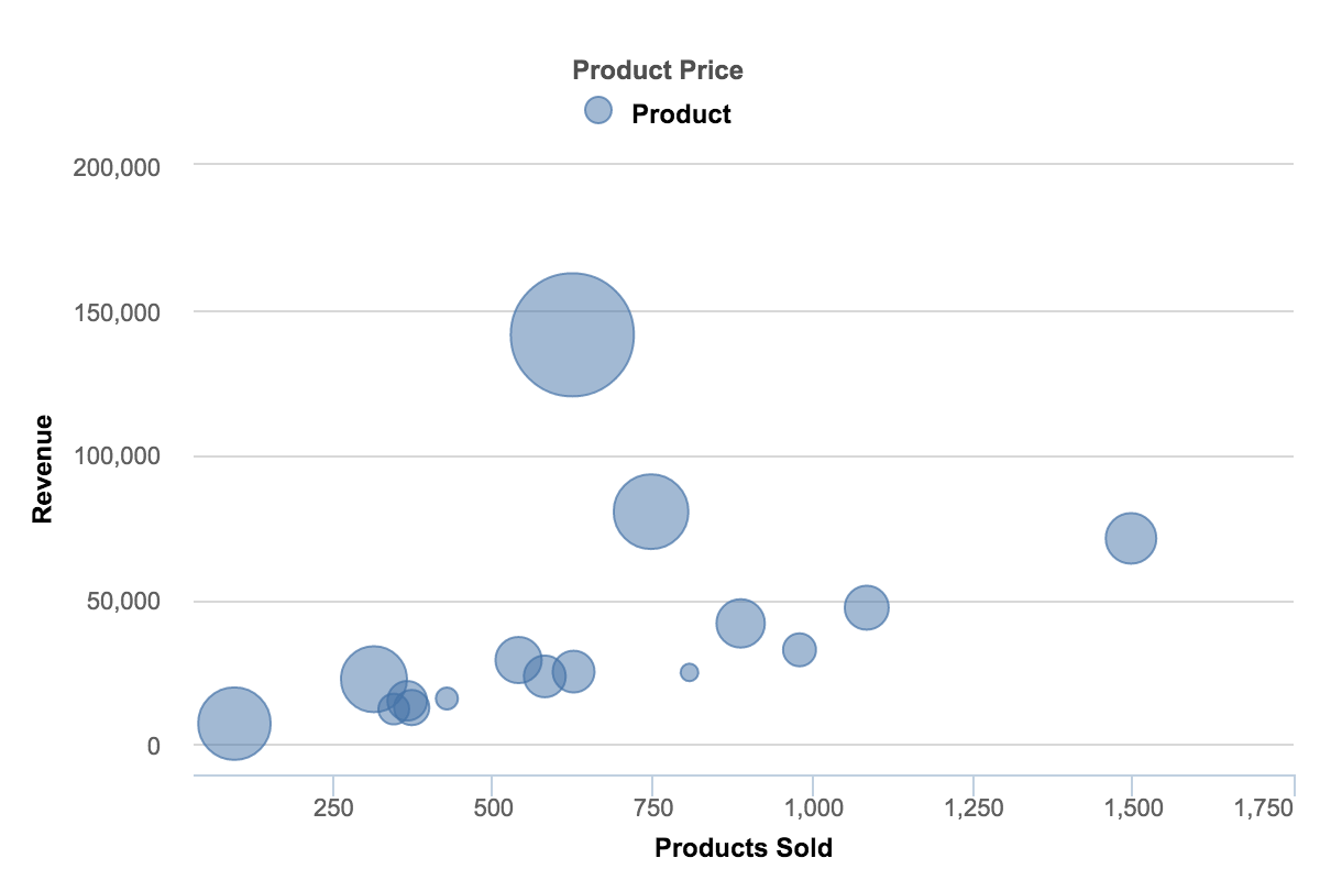
A bubble chart is a great option if you need to add another dimension to a scatter plot chart. Scatter plots compare two values, but you can add bubble size as the third variable and thus enable comparison. If the bubbles are very similar in size, use labels.
We could in fact add the fourth variable by color-grading those bubbles or displaying them as pie charts, but that’s probably too much.
A good example of a bubble chart would be a graph showing marketing expenditures vs. revenue vs. profit. A standard scatter plot might show a positive correlation for marketing costs and revenue (obviously), when a bubble chart could reveal that an increase in marketing costs is chewing on profits.
Use Scatter and Bubble charts to:
- Present relationships between two (scatter) or three (bubble) numerical variables,
- Plot two or three sets of variables on one x-y coordinate plane,
- Turn the horizontal axis into a logarithmic scale, thus showing the relationships between more widely distributed elements.
- Present patterns in large sets of data, linear or non-linear trends, correlations, clusters, or outliers.
- Compare large number of data points without regard to time. The more data you include in a scatter chart, the better comparisons you can make.
- Present relationships, but not exact values for comparisons.
Map Charts
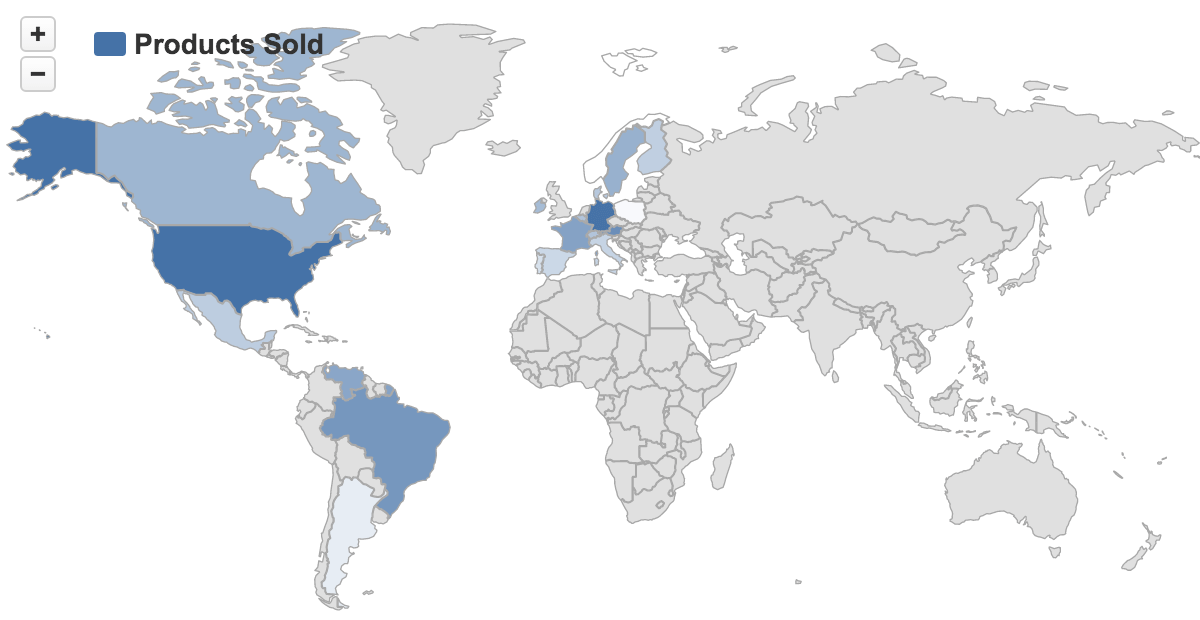
Map charts are good for giving your numbers a geographical context to quickly spot best and worst performing areas, trends, and outliers. If you have any kind of location data like coordinates, country names, state names or abbreviations, or addresses, you can plot related data on a map.
Maps won’t be very good for comparing exact values, because map charts are usually color scaled and humans are quite bad at distinguishing shades of colors. Sometimes it’s better to use overlay bubbles or numbers if you need to convey exact numbers or enable comparison.
A good example would be website visitors by country, state, or city, or product sales by state, region or city.
But, don’t use maps for absolutely everything that has a geographical dimension. Today, almost any data has a geographical dimension, but it doesn’t mean that you should display it on a map.
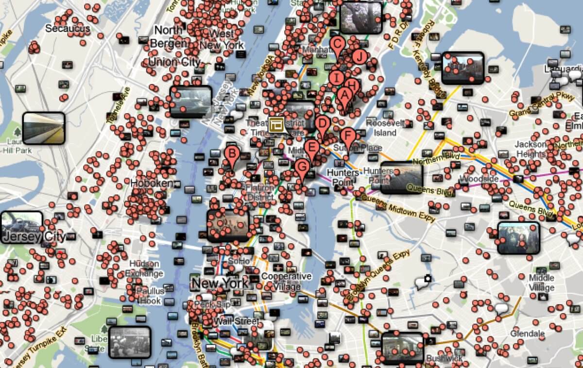
When to use map charts?
- If you want to display quantitative information on a map.
- To present spatial relationships and patterns.
- When a regional context for your data is important.
- To get an overview of the distribution across geographic locations.
- Only if your data is standardized (that is, it has the same data format and scale for the whole set).
Gantt Charts
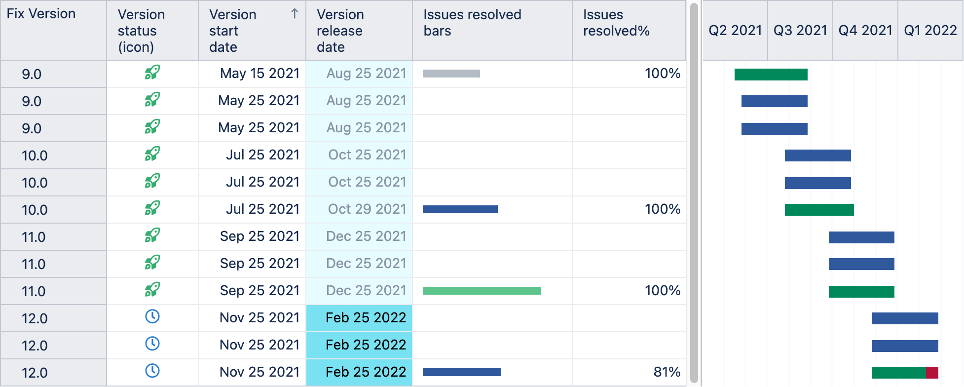
Gantt charts were adapted by Karol Adamiecki in 1896. But the name comes from Henry Gantt who independently adapted this bar chart type much later, in the 1910s.
Gantt charts are good for planning and scheduling projects. Gantt charts are essentially project maps, illustrating what needs to be done, in what order, and by what deadline. You can visualize the total time a project should take, the resources involved, as well as the order and dependencies of tasks.
But project planning is not the only application for a Gantt chart. It can also be used in rental businesses, displaying a list of items for rent (cars, rooms, apartments) and their rental periods.

To display a Gantt chart, you would typically need, at least, a start date and an end date. For more advanced Gantt charts, you’d enter a completion percentage and/or a dependency from another task.
Gauge Charts
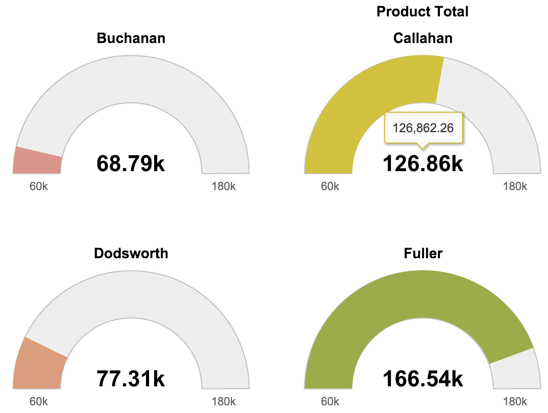
Gauge charts are good for displaying KPIs (Key Performance Indicators). They typically display a single key value, comparing it to a color-coded performance level indicator, typically showing green for “good” and red for “trouble.”
A Dashboard would be the most obvious place to use Gauge charts. There, all the KPIs will be in one place and will give a quick “health check” for your project or company.
Gauges are a great choice to:
- Show progress toward a goal.
- Represent a percentile measure, like a KPI.
- Show an exact value and meaning of a single measure.
- Display a single bit of information that can be quickly scanned and understood.
The bad side of gauge charts is that they take up a lot of space and typically only show a single point of data. If there are many gauge charts compared against a single performance scale, a column chart with threshold indicators would be a more effective and compact option.
Multi Axes Charts
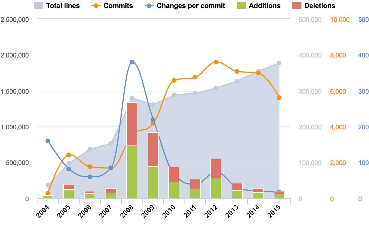
There are times when a simple chart just cannot tell the whole story. If you want to show relationships and compare variables on vastly different scales, the best option might be to have multiple axes.
A multi-axes chart will let you plot data using two or more y-axes and one shared x-axis. But it comes at a cost. That is, the charts are much more difficult to read and understand.
Multi-axes charts might be good for presenting common trends, correlations (or the lack thereof) and the relationships between several data sets. But multi-axes charts are not good for exact comparisons (because of different scales) and you should not use this type if you need to show exact values.
Use multi-axes charts if you want to:
- Display a line chart and a column chart with the same X-axis.
- Compare multiple measures with different value ranges.
- Illustrate the relationships, correlation, or the lack thereof between two or more measures in one visualization.
- Save canvas space (if the chart does not become too complicated).
Data Visualization Do’s and Don’ts – A General Conclusion
- Time axis. When using time in charts, set it on the horizontal axis. Time should run from left to right. Do not skip values (time periods), even if there are no values.
- Proportional values. The numbers in a chart (displayed as bar, area, bubble, or other physically measured element in the chart) should be directly proportional to the numerical quantities presented.
- Data-Ink Ratio. Remove any excess information, lines, colors, and text from a chart that does not add value. More about data-ink ratio
- Sorting. For column and bar charts, to enable easier comparison, sort your data in ascending or descending order by the value, not alphabetically. This applies also to pie charts.
- Legend. You don’t need a legend if you have only one data category.
- Labels. Use labels directly on the line, column, bar, pie, etc., whenever possible, to avoid indirect look-up.
- Inflation adjustment. When using monetary values in a long-term series, make sure to adjust for inflation. (EU inflation rates, US inflation rates)
- Colors. In any chart, don’t use more than six colors.
- Colors. For comparing the same value at different time periods, use the same color in a different intensity (from light to dark).
- Colors. For different categories, use different colors. The most widely used colors are black, white, red, green, blue, and yellow.
- Colors. Keep the same color palette or style for all charts in the series, and same axes and labels for similar charts to make your charts consistent and easy to compare.
- Colors. Check how your charts would look when printed out in gray-scale. If you cannot distinguish color differences, you should change hue and saturation of colors.
- Colors. Seven to 10 percent of men have color deficiency. Keep that in mind when creating charts, ensuring they are readable for color-blind people. Use Vischeck to test your images. Or, try to use color palettes that are friendly to color-blind people.
- Data Complexity. Don’t add too much information to a single chart. If necessary, split data in two charts, use highlighting, simplify colors, or change chart type.
