
eazyBI 6.2–Sparklines, Cell Formatting, and More
If you want to highlight a point or find a pattern, some visual aid helps a great deal. The latest eazyBI release includes several improvements for the table and gauge charts that will help you read your data so much easier. Furthermore, there are quite a few other much anticipated improvements worth mentioning so please read on.
In this article I’ll highlight a few eazyBI 6.2 version updates. If you want to go a little bit deeper, feel free to watch the recent release webinar:
If you just want a quick overview, please read on.
Sparklines
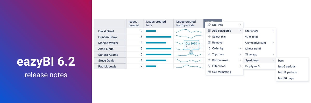
Sparkline is a tiny chart inserted in a table cell to provide visualization and trends of the measure. It can be used alone or added next to its data cell to give a greater insight into that particular measure. This new option provides the eazyBI table view with a lot more insights.
You can add Sparklines in eazyBI with a few clicks through standard calculations or create your own Sparkline data set with an MDX calculated measure. With this feature, not only can you see the data for the selected context, but, in a glimpse of an eye, you can compare it with others (sparkline bar) or see trends over time (line, area, or columns).
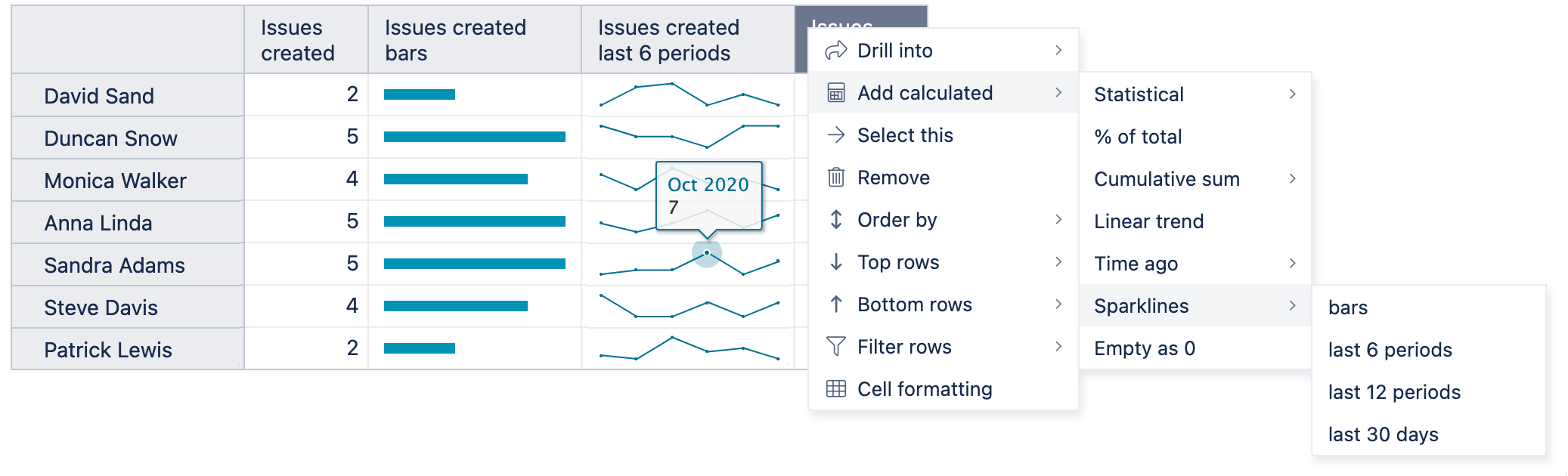
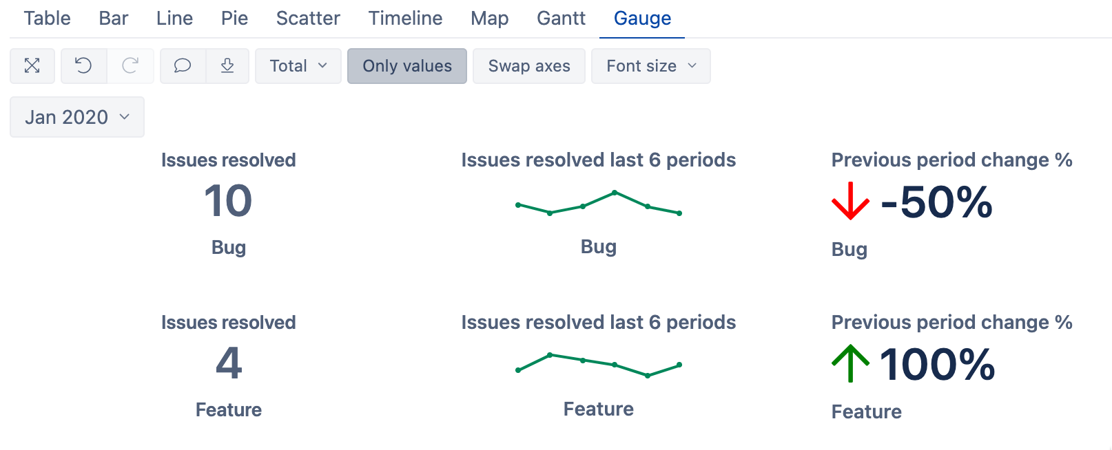
This new sparkline functionality can also be added to the Gantt and Gauge charts for more ways to create an overview dashboard.
Upgrade of Table Cell Formatting
When reading the data to find the trends and limit values, visual representation in the chart is very helpful, but the charts have limited options for representing text. The table is more convenient when you need some text next to the numeric value. To make tables easier to read and interpret, you can use table cell formatting.
A basic version of this feature has been available in eazyBI for some time, but it sees a whole new light in the latest eazyBI version. Now, not only can you highlight the range of values, but also add exact values, regular expressions, and create heatmaps.
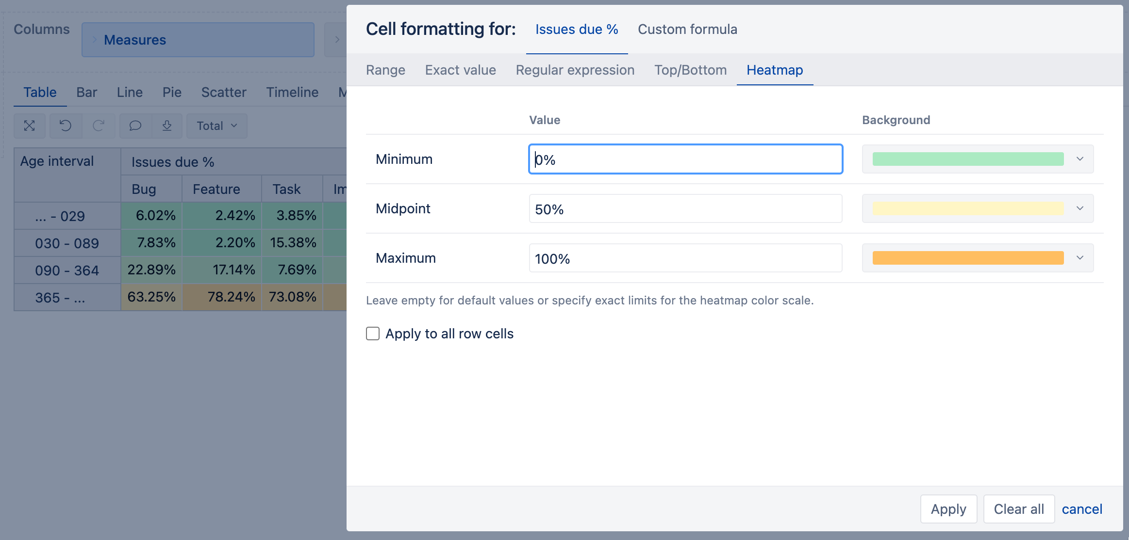
The new version of table cell formatting also gives an option to enter a custom MDX formula to define advanced criteria for highlighting cells. For example, you could highlight all cells where issues with the Highest priorities are created.
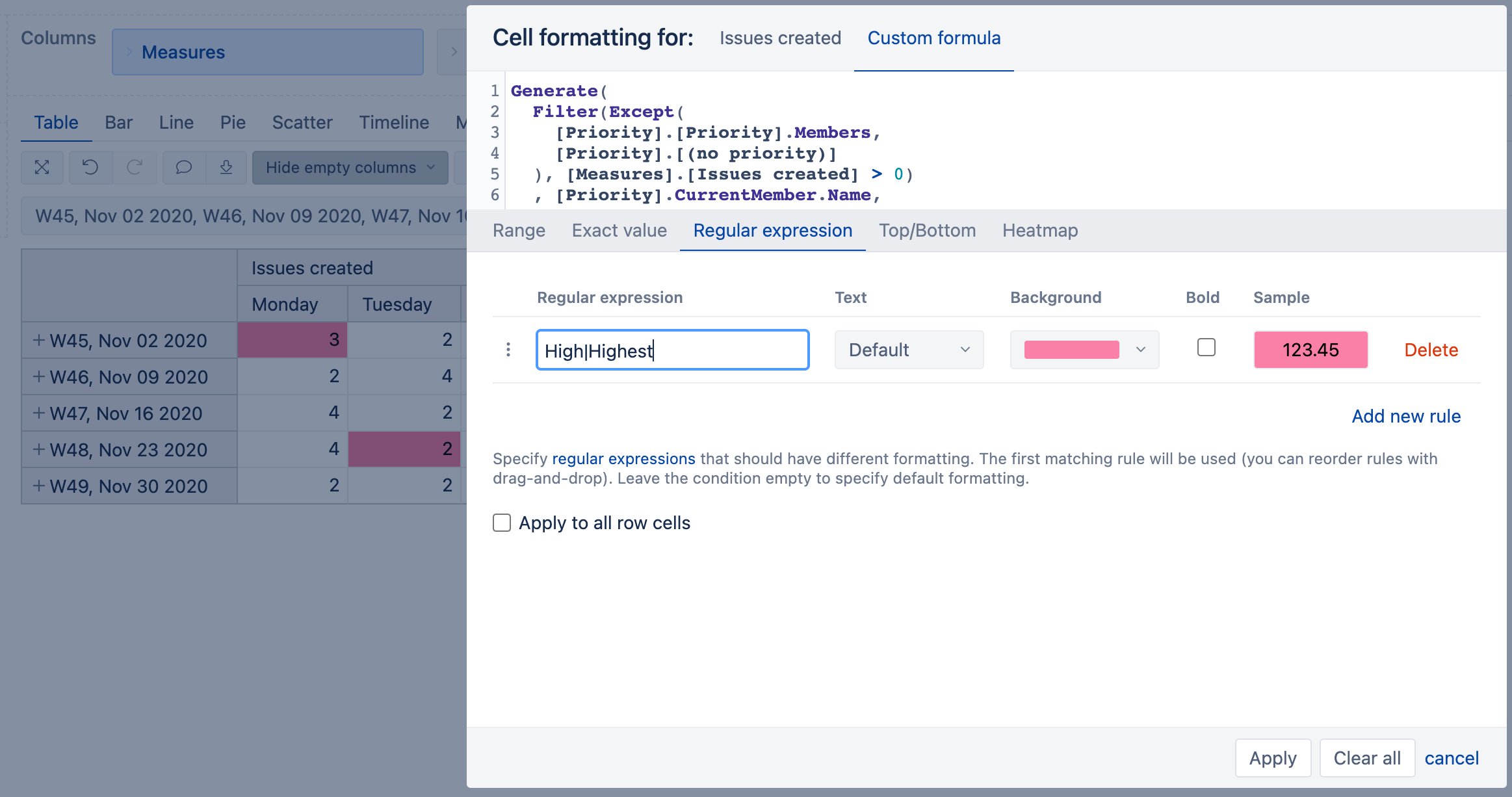
Furthermore, you can now add the formatting also to the Gantt chart table cells! Go ahead, experiment with text, relative date, and number highlighting to make your tables a whole lot more informative.
Text in Gauge
As tables are becoming more powerful, so are the eazyBI Gauge charts. Not only can you add Sparklines in the Gauge charts now, but starting from the latest version, you can also display the text fields in the Gauge chart only values view. Additionally, you can add a Markdown formatting to emphasize a point or add clickable URLs.
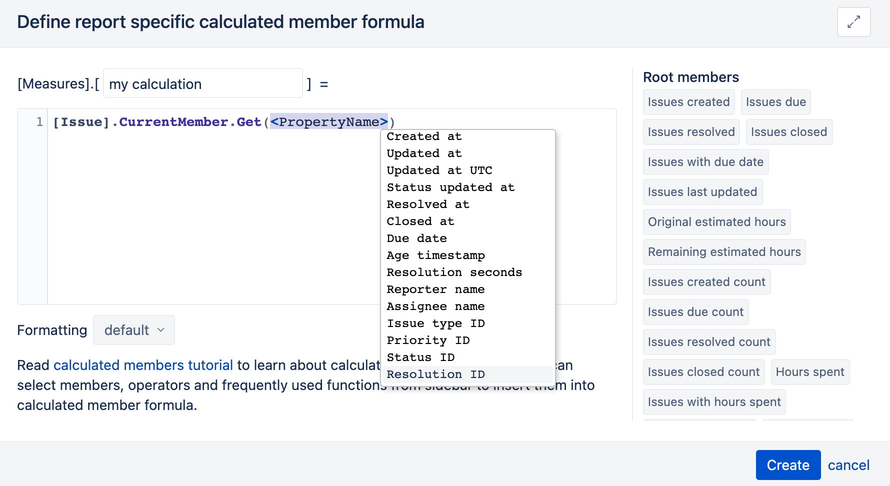
MDX Autocomplete Improvements
The MDX calculations provide “the next level” to the data analysis. Writing MDX calculations can be tough, which is why MDX autocomplete is one of the most beloved functionalities of eazyBI. As you may know, it is an outcome of an eazyBI team hackathon. While extensively using the functionality ourselves and hearing feedback from customers, we tackled it again, polishing it up and making it even more intuitive.
Now the autocomplete also recognizes the hidden measures and dimensions, properties, and level names. The typeahead will give more options to choose from–not only if the measure starts with the combination of letters, but also if it is found anywhere in the measure's name. Happy MDX coding!
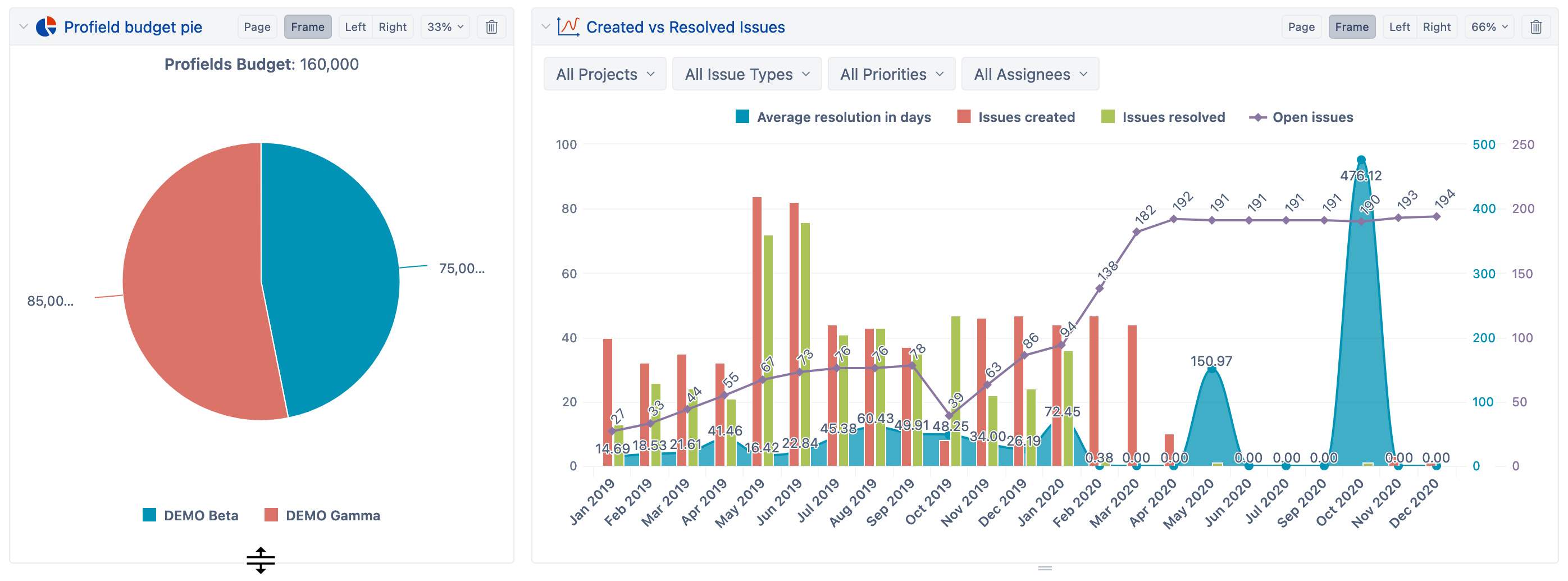
Dashboard Layout
The final step of displaying the charts is adding them to the dashboard. Until now, eazyBI has been calculating the charts' height dynamically, which sometimes made adding charts next to each other tricky. Now there is an option to resize the charts to adjust and fix their height, making the chart layout in the dashboard much more organized.
Improvements for the Atlassian Insight Integration
There are significant improvements for the eazyBI and Insight integration. Now you can import Insight custom field attributes for Jira issues. You can use this to access all specified attributes for Insight custom fields. You can import the data as dimensions or as properties in those dimensions.
Furthermore, now you can also use those properties to add custom hierarchy in Insight custom field dimension. For example, you could add employees as a sub-group of assets, or assets as a sub-group of asset-types–you decide.
And There Is More…
In addition to the great new end-user features, there are several back end improvements:
- An option to add automatic data import from files;
- Limiting the Test app imported data;
- Compatibility with MySQL 8.x.
You can learn more about all the new features and bug-fixes in the eazyBI 6.2 change log.