
eazyBI 6.4 – Hierarchies & Conditional Chart Formatting
eazyBI version 6.4 is released. From small user-interface improvements to conditional chart formatting. New Sprint and Issue type hierarchies, and the ability to create your own custom hierarchies from Jira custom fields. We are happy to share with you what's new.
Sometimes the smallest changes can make the biggest impact. Customers asked, and we listened. Now there are two separate buttons for saving reports: "Save" and "Save As." It is handy if you want to create your own report based on a sample or a template report. Also, we included the option to transform report-specific measures into user-defined measures. It allows to play around with different calculations and formulas, and when something powerful (and tested!) is created, it can be quickly made to be available for others.
Conditional formatting was recently improved for table views. Now it is available in full glory also for different charts to make them easier to read and, well, to look nicer. You can be both — a data analyst and an artist!
Starting from this version, we expanded the possibility to create custom hierarchies. Why does it matter? Custom hierarchies enable grouping data in the most suitable way for your use case. They are easier to maintain compared to calculated members and reports are faster as well. Custom hierarchies are now available for dimensions that are imported from Jira custom fields. In addition, there are a few new default hierarchies in the Sprint and Issue type dimensions.
For a quick overview of the main new features, check out the recording from the release webinar.
For a quick overview, please read on.
Use Conditional Formatting in Charts
Earlier this year, in eazyBI version 6.2, we introduced improved conditional cell formatting. That received our customer appreciation. Now we are happy to announce that conditional formatting is also available for charts! Straight away, you can explore your charts in more detail – see outliers and highlight outstanding data in bar, line, or timeline charts for column, range, scatter, or bubble chart types.
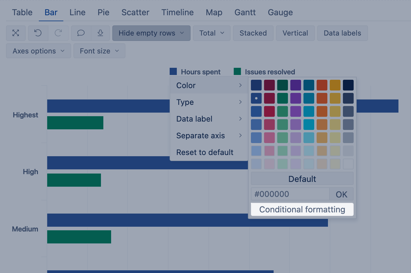
Highlight Ranges, Exact Values, Top & Bottom Values
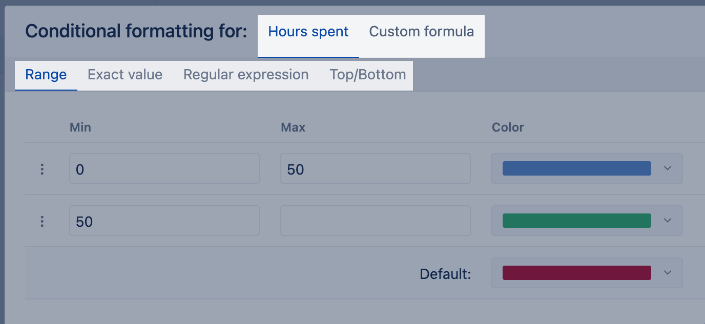
Conditional chart formatting can highlight issues from specific groups, the top and bottom values in the chart, and more. The configuration is very similar to the table's cell formatting: use range, exact values, regular expression, or top/bottom values. The rules can be applied to a measure directly or you can explore options with the Custom formula.
Color the top and bottom values in different charts with Top/bottom conditional formatting.
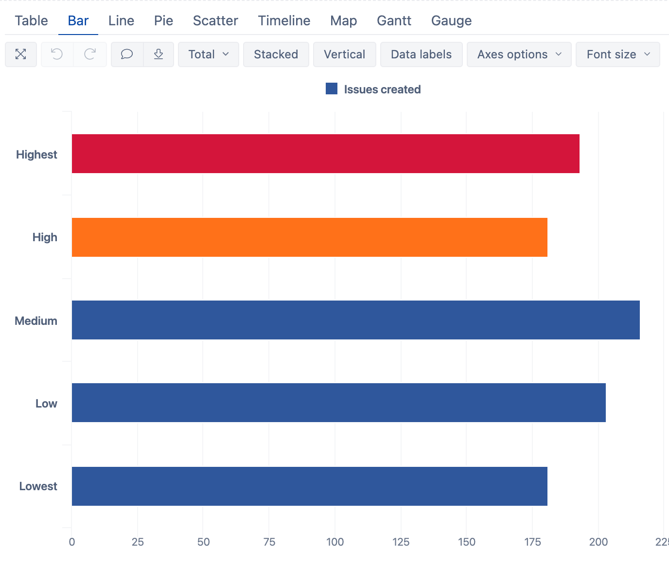
Custom Chart Conditional Formatting
Use a custom formula for more advanced highlighting rules. For example, highlight "Highest" and "High" priority issues by name:
Get inspired on how to use different conditional options to make reports visually outstanding in the eazyBI demo dashboard "Customized Charts". Explore and learn how to become an artist with your data!
New Hierarchies for Sprint and Issue Type Dimensions
Use new hierarchies in Sprint and Issue Type dimensions to regroup dimension members using member properties.
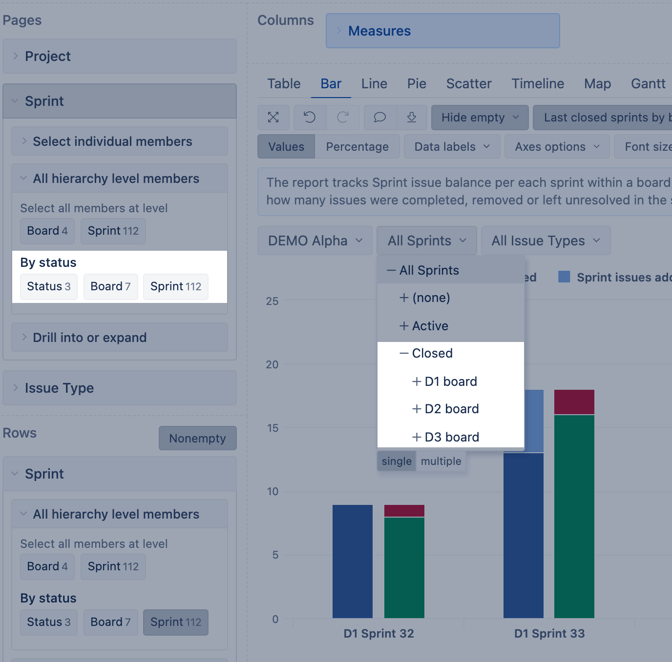
Group Your Sprints by Status
Filter all closed sprints for the board much faster by using the "By status" hierarchy in the Sprint dimension.
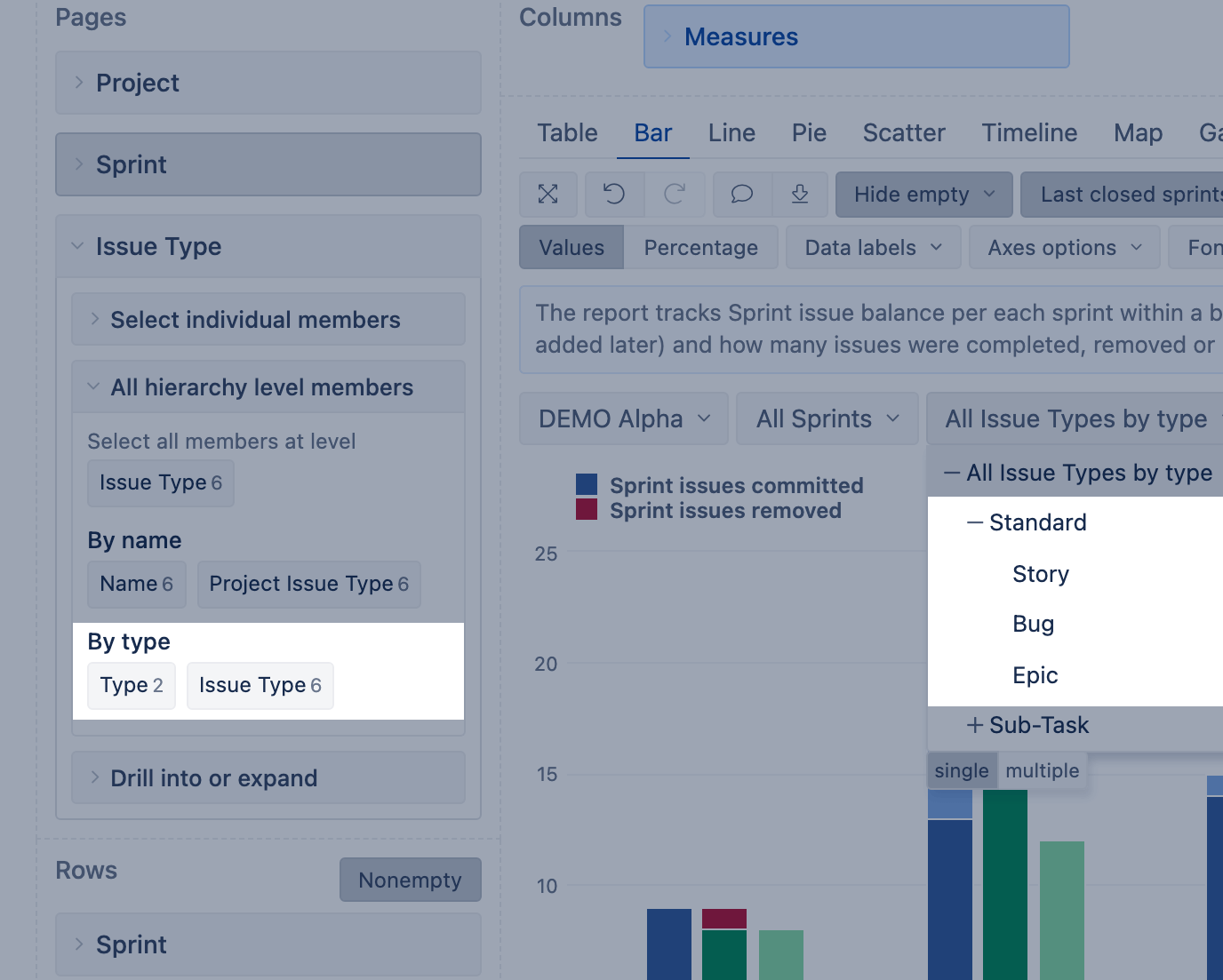
Group Your Issue Type by Type
Use the new "By type" hierarchy in the Issue Type dimension to quickly filter all standard types excluding sub-tasks for your reports.
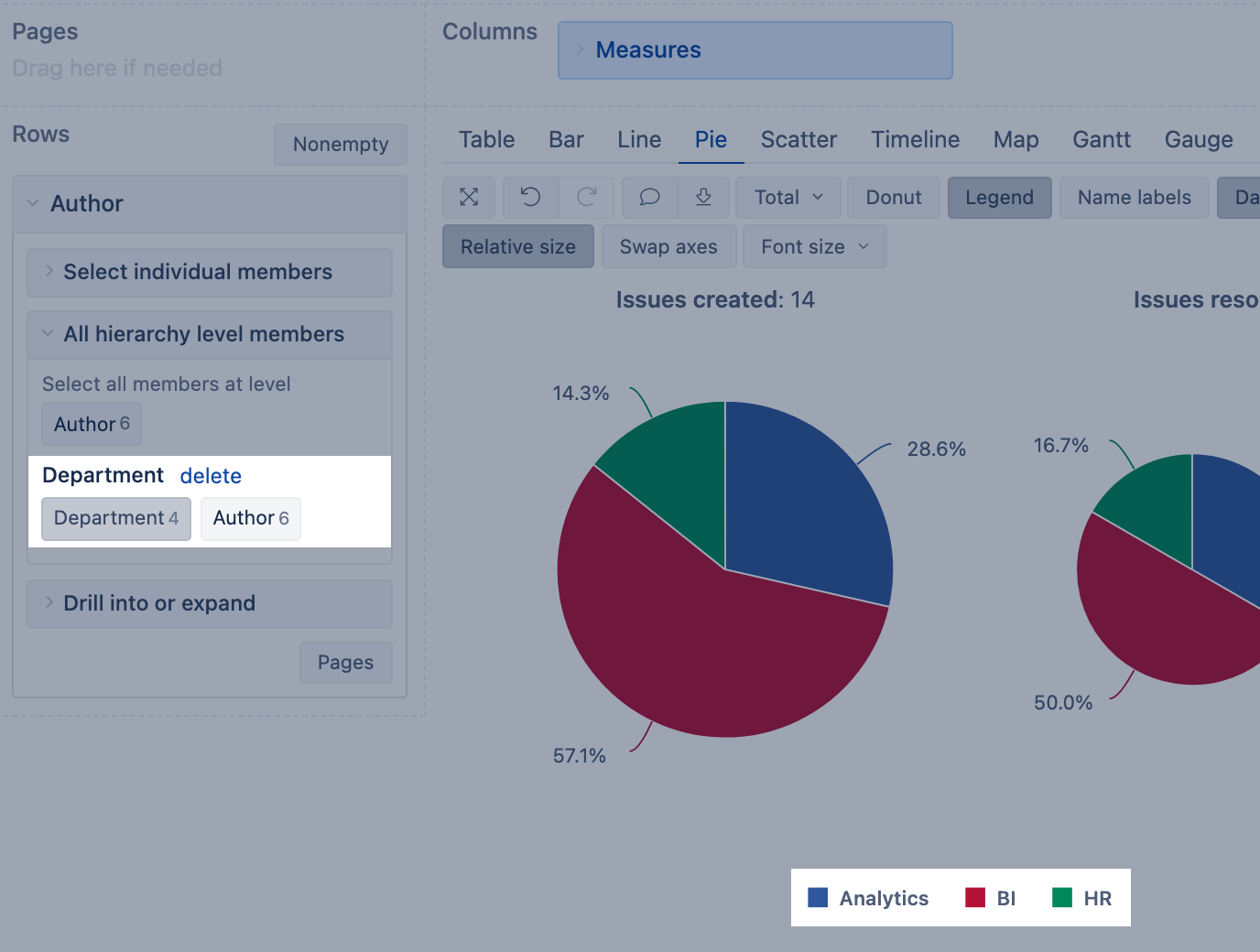
Add Custom Hierarchies from Jira Custom Fields
Use single-select Jira custom fields (numeric or string) to create new custom hierarchies. You can also regroup custom field dimension members using additional imported properties.
Learn more about all the new features and bug fixes in the eazyBI 6.4 changelog.