
Custom Jira Reports: How to Create Jira Reports with eazyBI?
Have you reached the limit of built-in Jira reports? Ready to move to the next level? You don’t need to be a programmer, an IT graduate, or a data analyst to build advanced custom reports in Jira using eazyBI. In fact, you don’t even need to install eazyBI to try it out.
In this step-by-step guide, I’ll show you how you can build useful reports in minutes using only your computer mouse and your best “clicking finger”.
So what is eazyBI for Jira?
eazyBI for Jira is a powerful reporting app for Jira Cloud, Server, and Data Center, integrated seamlessly into Jira.
eazyBI has been among the top-selling apps on Atlassian Marketplace for years, and for a good reason. When it comes to Jira reporting, you can do virtually anything with eazyBI–from basic reports and pivot tables to complex charts, dashboards, and completely unique use-cases.
It always amazes me what you can do with eazyBI. I think we’re yet to find something where we’ve not been able to do what we want to do!
~ Paul Hardaker, Head of DevOps and R&D Operations, Global Decision Analytics at Experian
How is eazyBI Different From Built-in Jira Reports?
Jira already has a set of reports, dashboards, gadgets, and tools to measure Jira data. Why would you need another tool for that?
If you’ve tried to use Jira reports for your Jira reporting needs, you probably know that the built-in report configuration and customization options are very limited.
eazyBI for Jira removes those limits. It brings new dimensions, metrics, charts, calculations, and unlimited customization options for Jira analysis and beyond. And all that within Jira, without the need of any other external tools.
When importing data, eazyBI reorganizes it into an analytical “data cube”–a performance optimized multi-dimensional analytical database. Having a separate OLAP database enables much quicker responses and also reduces the impact on Jira. It also lets you analyze the history of the data. You can store historical values of statuses, assignees, and more, to see how these values change over time, how long issues stay in each status, etc.
eazyBI is an extremely flexible and useful app. It certainly takes your Jira reporting to an advanced level. Anything from lowest details to a high profile interactive executive dashboards can be built seamlessly. On top of this, you will be able to perform any calculations and derive any insights not only from literally every Jira field, but also combine and map them to multiple sources of data. Their support is top-notch!
Alex Surkov, Deloitte
Analyze Data From Different Sources
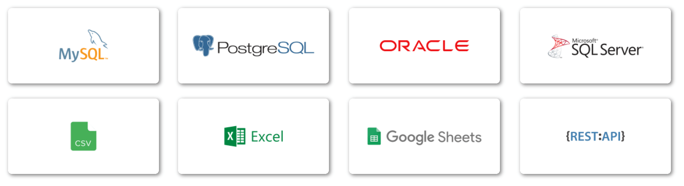
In eazyBI, you can analyze data from Jira Software, Jira Service Management, and many popular Atlassian and 3rd party Jira apps like Insight, Bitbucket, Bamboo, Tempo Timesheets, Tempo Planner, Zephyr for Jira, Zephyr Scale, Xray, Projectrak, and more. Check out the full list of eazyBI integrations.

You can also analyze and visualize your data from external data sources like SQL databases, Rest API, spreadsheets, and CSV files. Check out the full list of supported eazyBI data sources.
Try eazyBI Without Installing
eazyBI for Jira provides good support and straightforward documentation. What if you don’t know the tool and you would like to test it beforehand.
Installing eazyBI in Jira Cloud is straightforward. But for Jira Data Center, you’ll need set up the database and do some configuration.
What if you don’t have the access, the time, or the patience to set up a trial instance? What can you do?
The good news is that there is a way to test the tool without even installing it. There’s a public demo environment fully equipped with samples. You don’t need to install anything. You can access dozens of report examples, enjoy the experience, and play around directly in eazyBI demo accounts!
eazyBI Playground
Probably the easiest way is to start with the eazyBI Playground.

It’s the fastest and the simplest way to try the eazyBI report builder in action without signing-up or installing anything.
Read on to get familiar with some basic concepts and build your first reports.
Basic Terms and Concepts
eazyBI is a fully-featured business intelligence (BI) app. As with all data analysis tools, there are some inherited complexities. To better understand how data analysis tools work, there are a few basic concepts and terms you have to know before you can get started:
- What are eazyBI accounts;
- What is a dimension;
- What is a measure;
- How to use the eazyBI report builder.
But worry not, I’ll quickly introduce you to all these concepts.
eazyBI Accounts
eazyBI accounts are somewhat similar to Jira projects. That’s the place where you import your data, create data sets (a.k.a. data cubes), build reports, dashboards, and assign account users.
In eazyBI, you can have one or many accounts. Each account is like an isolated “data silo”. You can import data from one or many Jira projects and other sources. You get to decide what data you want to import, limit user access, etc.
For example, you can have one eazyBI account where you import all your projects and have general overview reports across all your projects. And, you could have a single-project account with as many details as possible for in-depth project-level reports.
Data Dimensions
In eazyBI, all available dimensions are available at the top of the report builder. When building reports, you drag-and-drop those dimensions to rows or columns. Simply put, the dimensions help you structure (or break down) the information the way you need it.
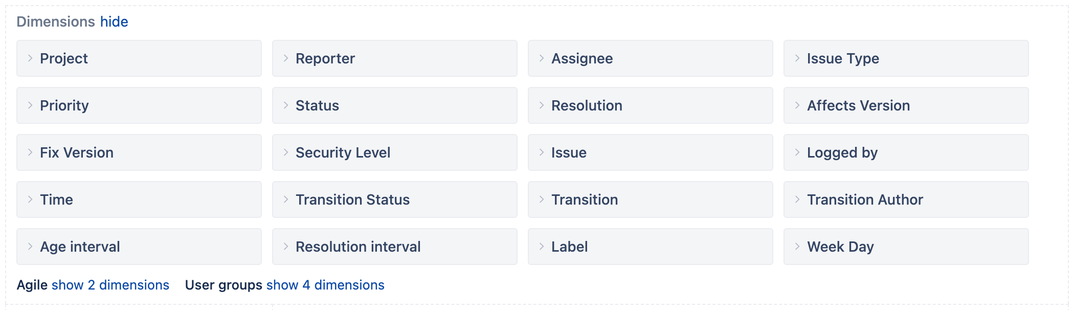
For example, if you want to get some information for a specific year, quarter, month, or day. You can use the “Time” dimension, where you can see the top-level “All times” hierarchy member and expand it down to a specific year, quarter, month, or day.
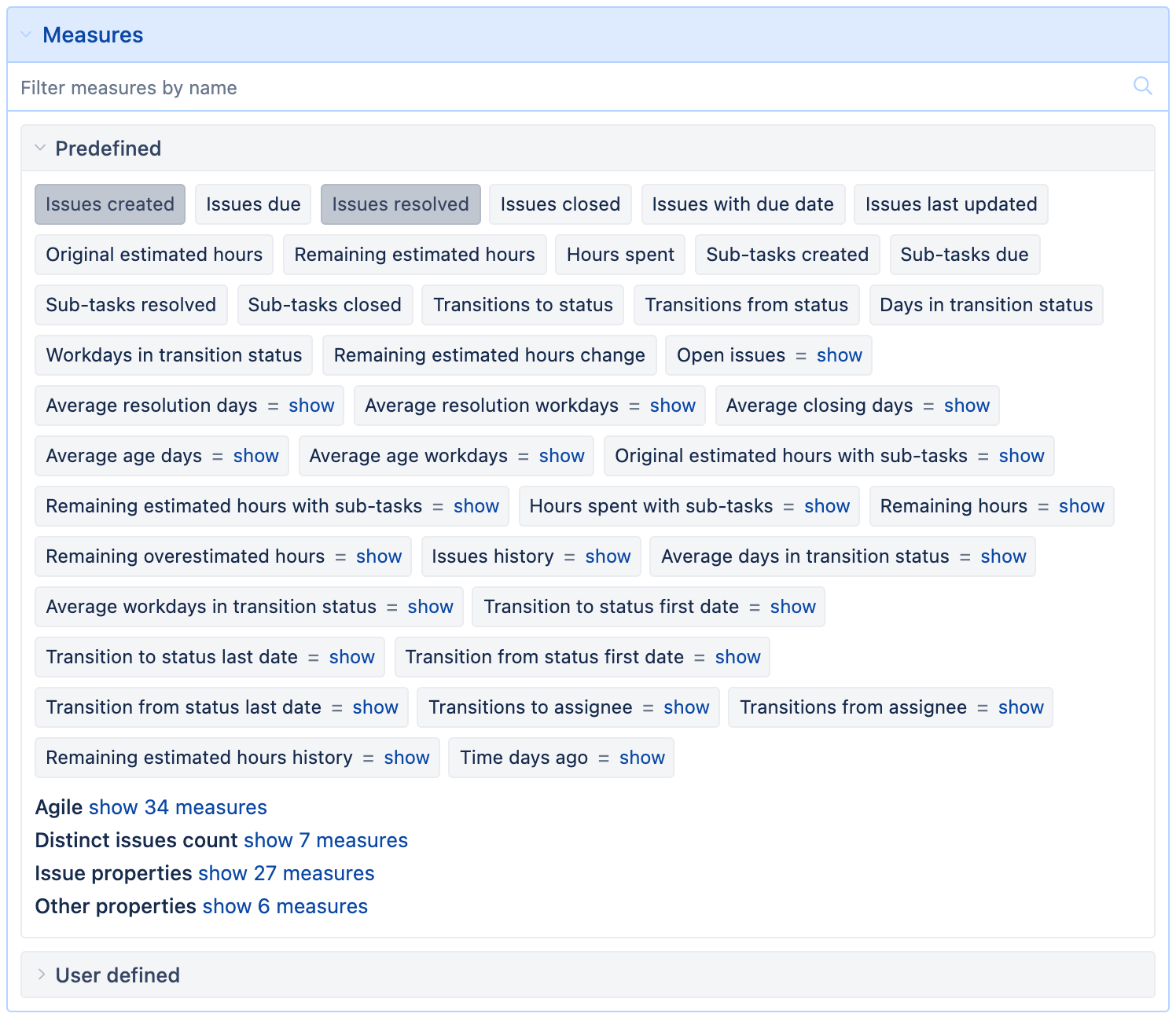
Measures
As the name suggests, measures are values you can measure or express as a number. Measures can be numerical values, but you can also measure “counts”. For example number of issues in a project.
eazyBI comes with dozens of predefined standard and custom measures. Issue counts, estimated and spent hours, resolution days, and much more.
You can also define your own measures and calculations using an MDX query language by Mondrian.
eazyBI Report Builder
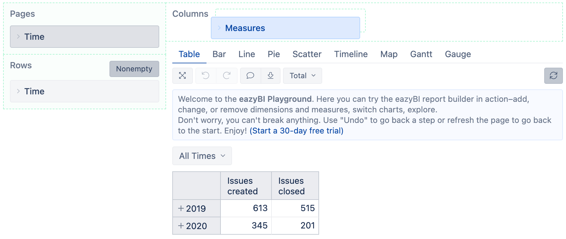
Let me quickly introduce you to the report builder interface.
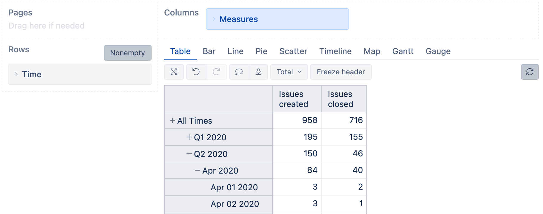
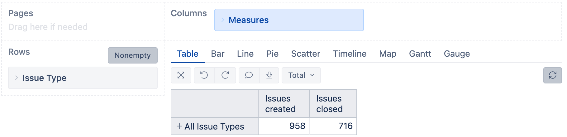
You'll see a simple table report when you first open the playground report.
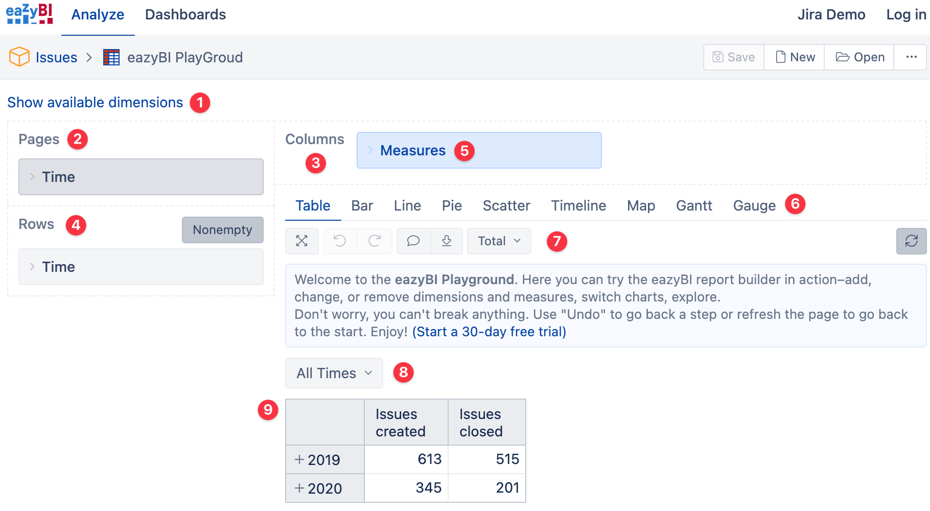
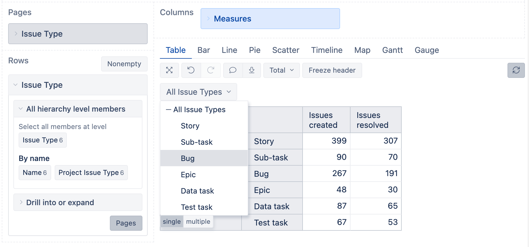
- Show or hide all available Jira dimensions.
- The “Pages” area is where you can add dimensions you want to use as filters in your reports. Those filters then appear as drop-down selectors (8) in the report and can be used as “Common filters” in dashboards to filter all reports in a dashboard at once.
- The “Columns” area will have the “Measures” dimension (5) already pre-selected by default. You can add other dimensions to columns if needed.
- The “Rows” area is where you can add dimensions to “break down” (group) the measures selected in columns. In this example, “Issues created” and “Issues closed” by year.
- The “Measures” dimension. This one is essential and cannot be removed. You can expand it to see all available measures, pick the ones you want to analyze, or add your own custom calculated measures.
- The chart-type selection tabs. You can change chart type at any moment–feel free to explore and experiment to find the best visual representation of your data.
- Expand, Undo, Redo, Chart Notes, and Export buttons, as well as chart settings. More options available for charts.
- The drop-down filter with all the dimension members from the “Page” area (2).
- The report area.
Building Your First Report
Now that we’ve covered the basics let’s build a few reports. We’ll use the eazyBI playground report as our workspace.
Feel free to follow along in this virtual mini-workshop. Don’t worry, your changes won’t be saved.
Created and Closed Issues by Issue Type
First, let’s remove the “Time dimension” and replace it with the “Issue Type” dimension. To do that:
- Hover over the “Time” dimension in Rows and click on the “x” to remove it,
- From the dimensions area, drag the “Issue Type” dimension into Rows.
You have built a single-row table with a total number of issues created and issues closed across all issue types. (“Issues created” is the default pre-selected measure when you create a new report).
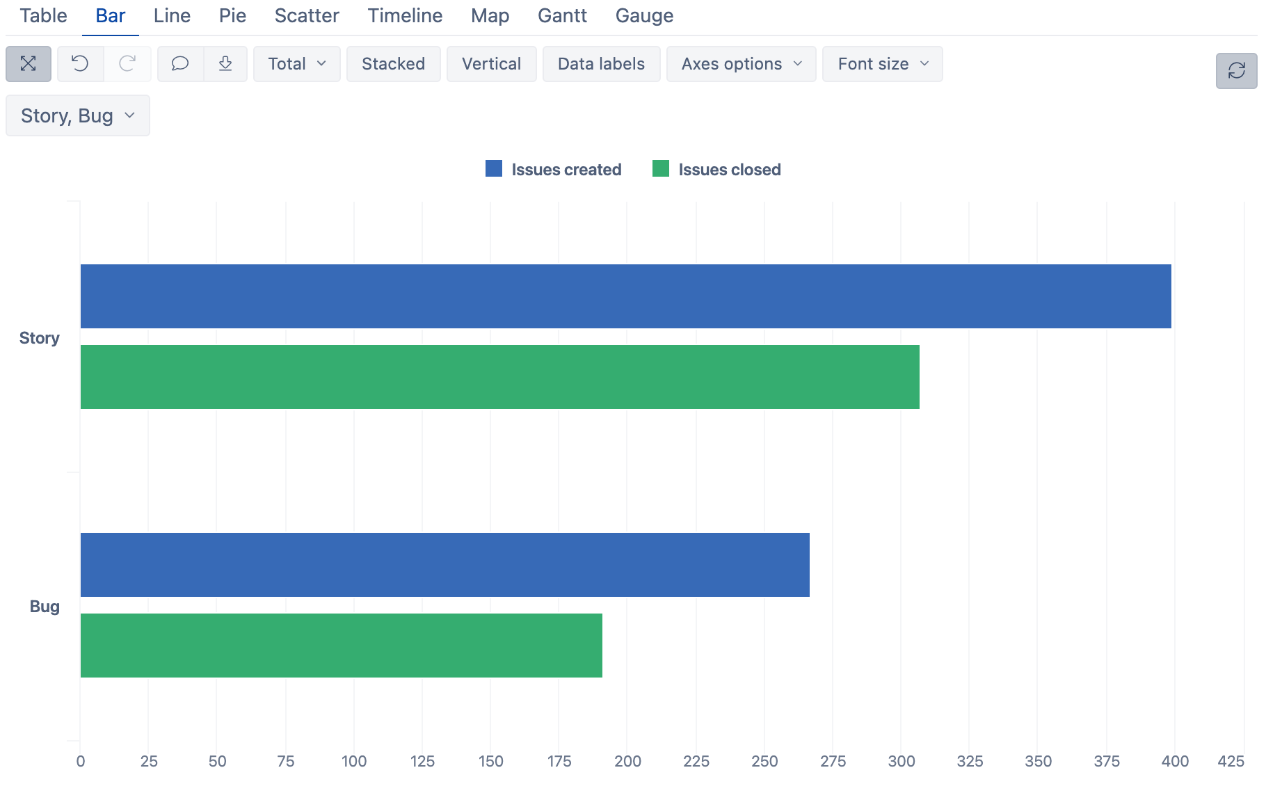
Converting Table Into Bar Chart
To convert this simple table report into a bar chart, click on the “Bar” tab in the chart-type selector.
To hide (or show) report builder blocks–dimensions, rows, columns–use the “Expand” icon on the left side of the report menu.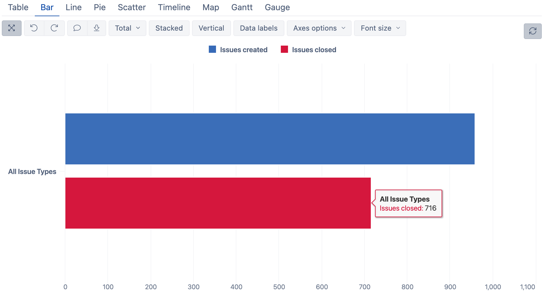
Customizing Your Charts
Let’s change the assigned color for “Issues closed”. Click on the colored square in the chart legend and open the color selector. Select the green color for resolved issues.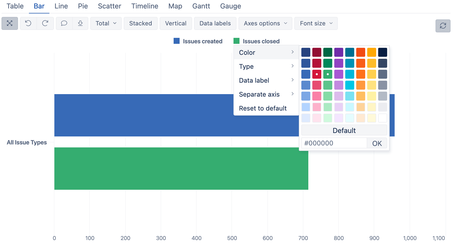
You can click and interact with almost every element in eazyBI charts and tables–the legend label and the legend color key, data labels, and bars.
If you click on a legend color key, you can change colors, add labels, move one or more measures to separate axes, and even add other chart types to the mix.
Try it to learn about available configuration options.
Explore Your Data
Clicking on measure labels or data bars will give you different data exploration options like “Drill into”, “Drill across”, etc.
The “Drill into” will open and expand the next hierarchy level. For example, expand the Year dimension to see Quarters. The “Drill across” is a very powerful data exploration feature allowing you to break down selected data by another dimension.
Let’s drill into “All Issue Types“ to see how all the issues break down by specific Issue types.
Click on “All Issue Types” and then “Drill into”.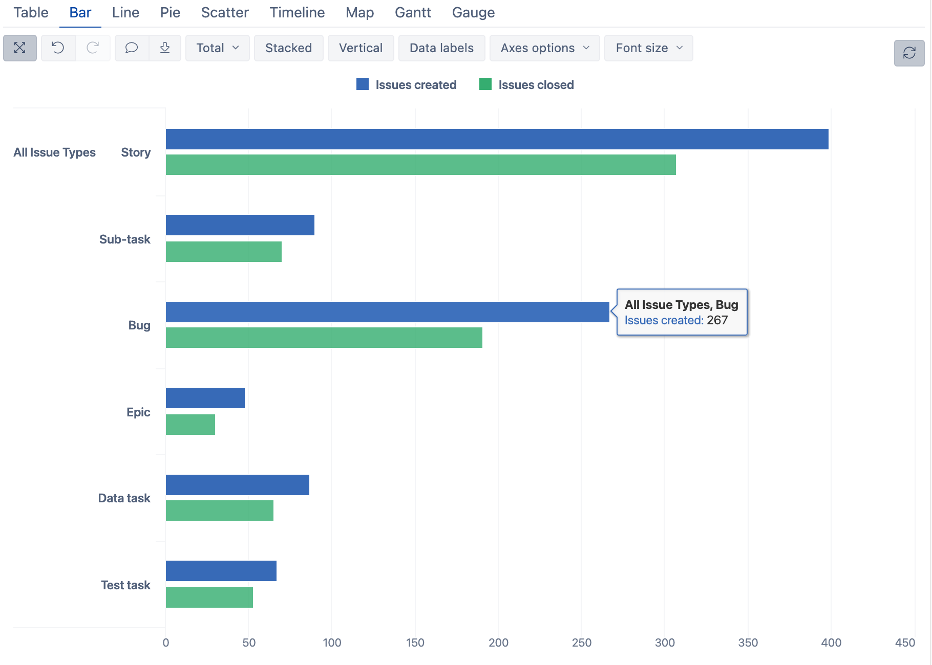
If you would now switch back to your table, you’d see that eazyBI has updated the information in the table also. Sometimes it’s easier to explore the data from the chart, but for more complex charts, it’s better to prepare the data in the table first before switching to a chart.
If you want to build a slightly different report than the one you already have, you do not need to start from scratch. You can always save the current report, alter it, and save it as a new one.
Adding Page Filters
What if you want to specify which issue types to show in the report? You can use “Pages” filter to add report-level filters. These filters can also be used as “Common filters” in dashboards.
To do that, drag-and-drop any dimension in the “Pages” section, and it will appear as a drop-down selector above the chart.
You can also “Duplicate” one dimension to have it both in “Rows” and also in the “Pages”. To do that, in the “Rows” area, click and expand “Issue Type” dimension, and click on the “Pages” button at the bottom-right corner of the expanded block.
Now the “Issue Type” dimension is also added to the “Pages” section and appears as a drop-down filter in the report. This drop-down filter will let the user select which issue type (or multiple types) to show in the report.
If you go back to your Bar chart, the filter is still there and you can see all the issue types.
For example, you can select “Bug” and get the report only for bugs.
If you want to compare more than one issue type, switch from “Single” to “Multiple” value selection and click on “Story” and “Bug”, then click “OK”.
Building More Advanced Charts
Let’s continue from where we left off and take this one step further. We’ll add one more dimension to the mix.
- First, remove the “Issues closed” measure. You can do that by clicking on “Issues closed” in the legend and then “Remove”, or un-selecting the measure in the “Measures” dimension.
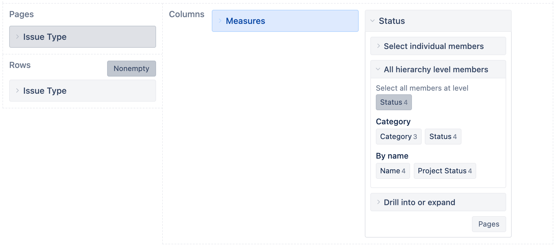
- Next, add the “Status” dimension in “Columns" right after “Measures”.
- By default, eazyBI will use the top-level member “All statuses”, but we want to open all underlying statuses. To do that, click on the “Status” dimension to expand it, and in the “All hierarchy level members” select the “Status“ level.
You should get a chart like this below.
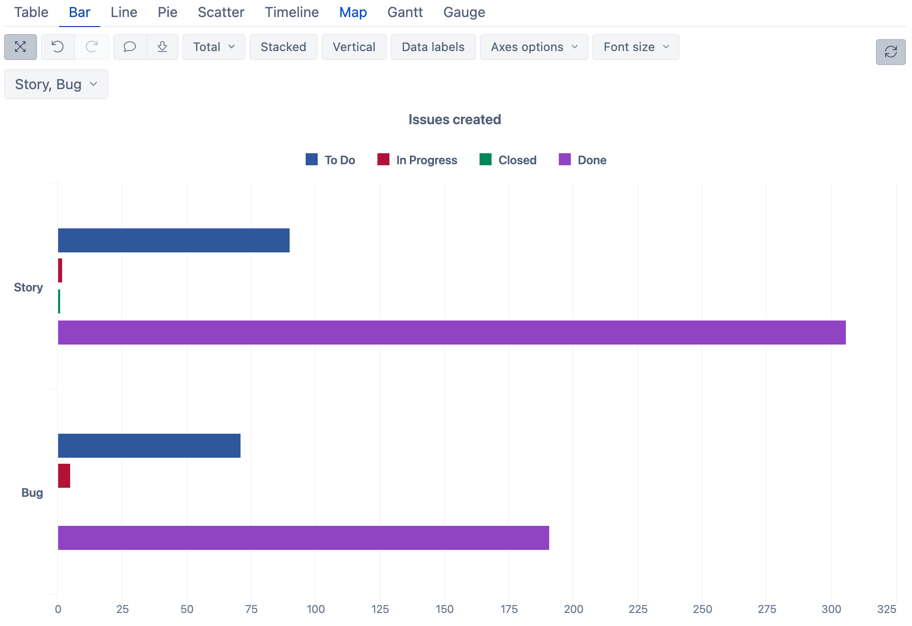
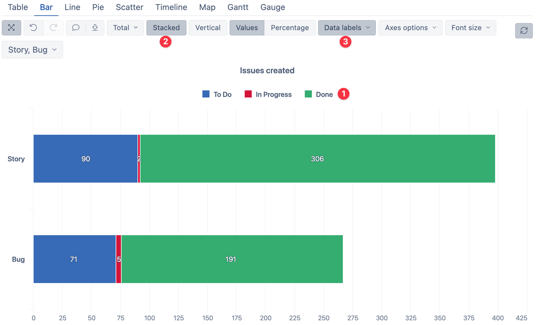
We’ll do a few more things:
- Remove the “Closed” status from the chart. In the chart legend, click on the label “Closed” and then “Remove”.
- Make this report “Stacked”–click the “Stacked” option.
- Add “Values”from the “Data labels” drop-down.
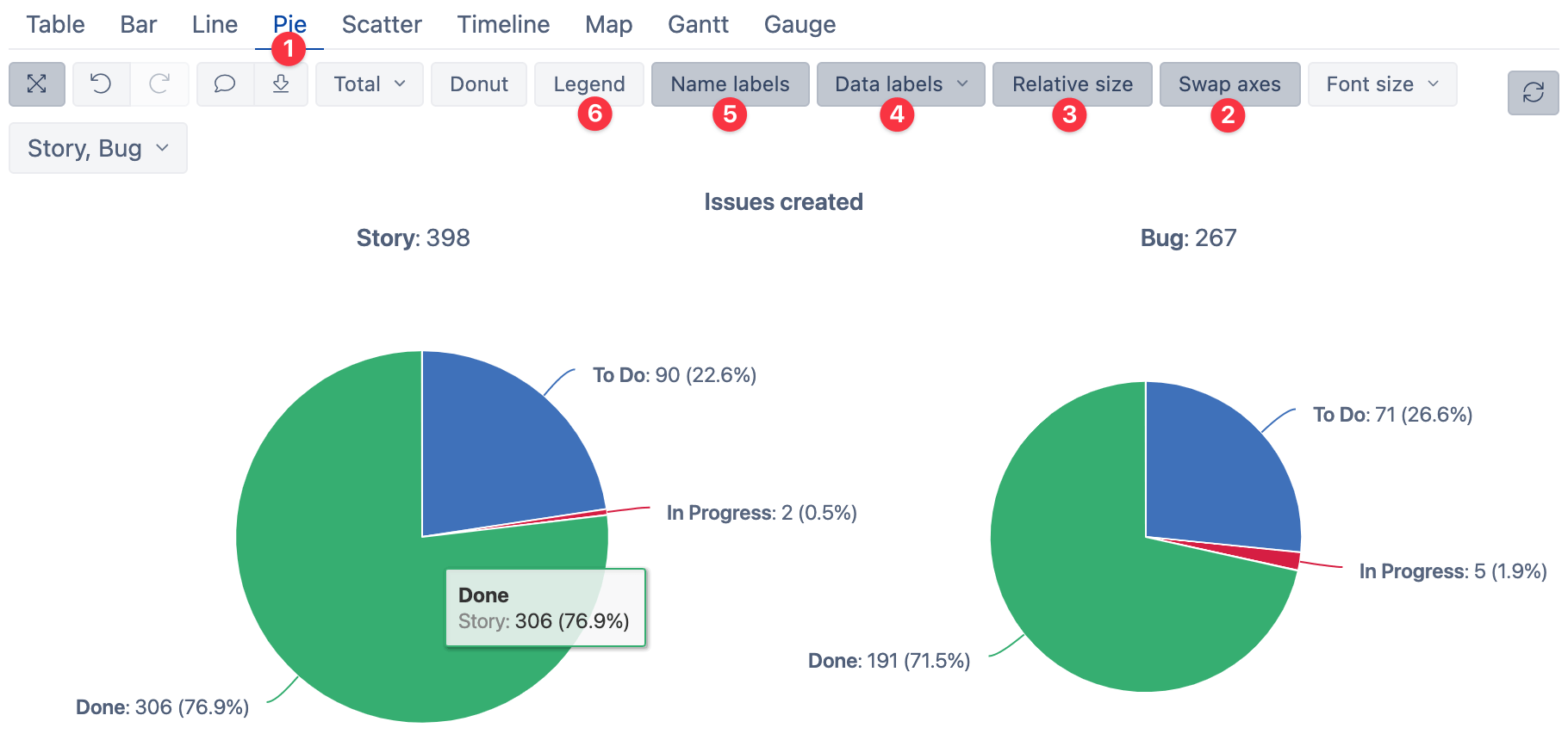
Creating Pie Charts
When it comes to comparing values, it is always better to use bar charts (Learn more about how to pick the right chart type). But sometimes, we want to understand the overall composition of each set via pie-charts.
Starting from the previous report:
- Switch chart type to a Pie chart.
- You’ll notice that the pies are split by “Issue status” and composed of “Issue types”. To change the composition by “Status” instead, use “Swap axes” option.
- Enable “Relative size” to scale pie sizes based on the number of issues created.
- Add “Values and percentage” data labels to be able to read the data more efficiently.
- Add name labels directly to the pie wedges.
- Remove the legend, which is now redundant.
Line Charts and Trends
Let’s take a look at those created and closed issues from a different perspective. You might be interested in knowing how those two measures are changing over time and what’s the overall trend.
We’ll start from the beginning for this one, so refresh the eazyBI playground report to get back to the starting point.
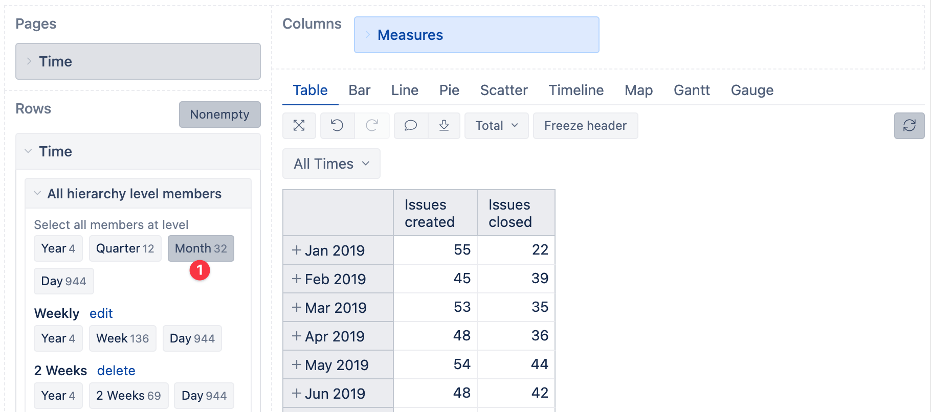
To see all created and closed issues only by month and hide other levels, expand the Time dimension and select “Month” from the “All hierarchy level members”.
The “Nonempty” button in the “Rows” area will hide all empty rows which contain no data.
Now switch to a line chart and assign the same colors as before for consistency: blue for issues created and green for issues closed.
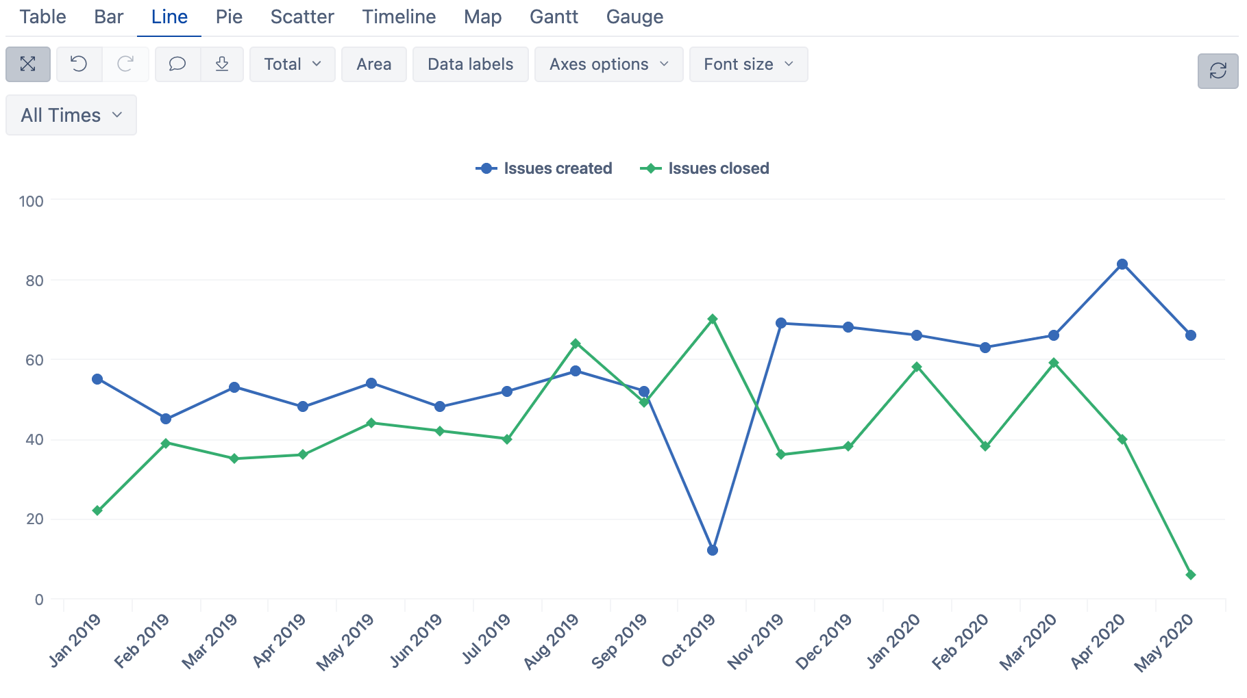
While this already looks good, these lines do not give a clear perspective yet. We’ll add linear trendlines for both measures to improve that.
Click on the measure name in the legend and select “Add calculated” > ”Linear trend”
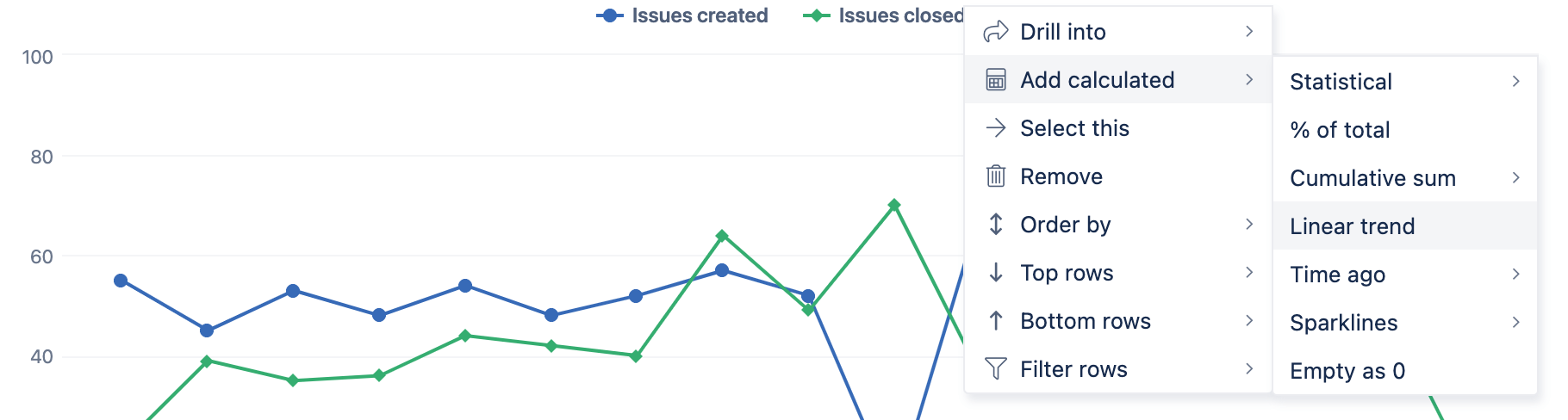
Now you have linear trends for both measures. New issues are created faster than issues are closed–a very common trend.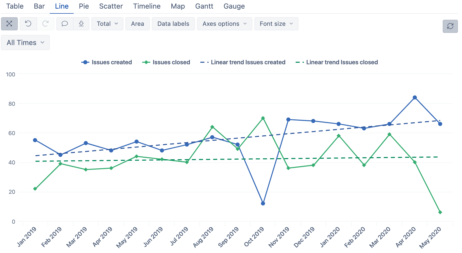
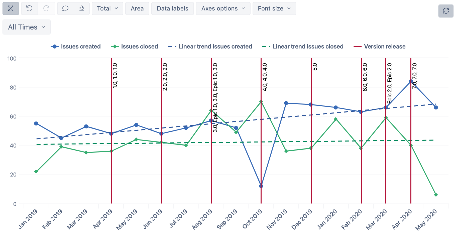
Version-Release Charts
Before we round-up for this section, it would be great to see how this created and closed issues trend correlates to actual version release dates.
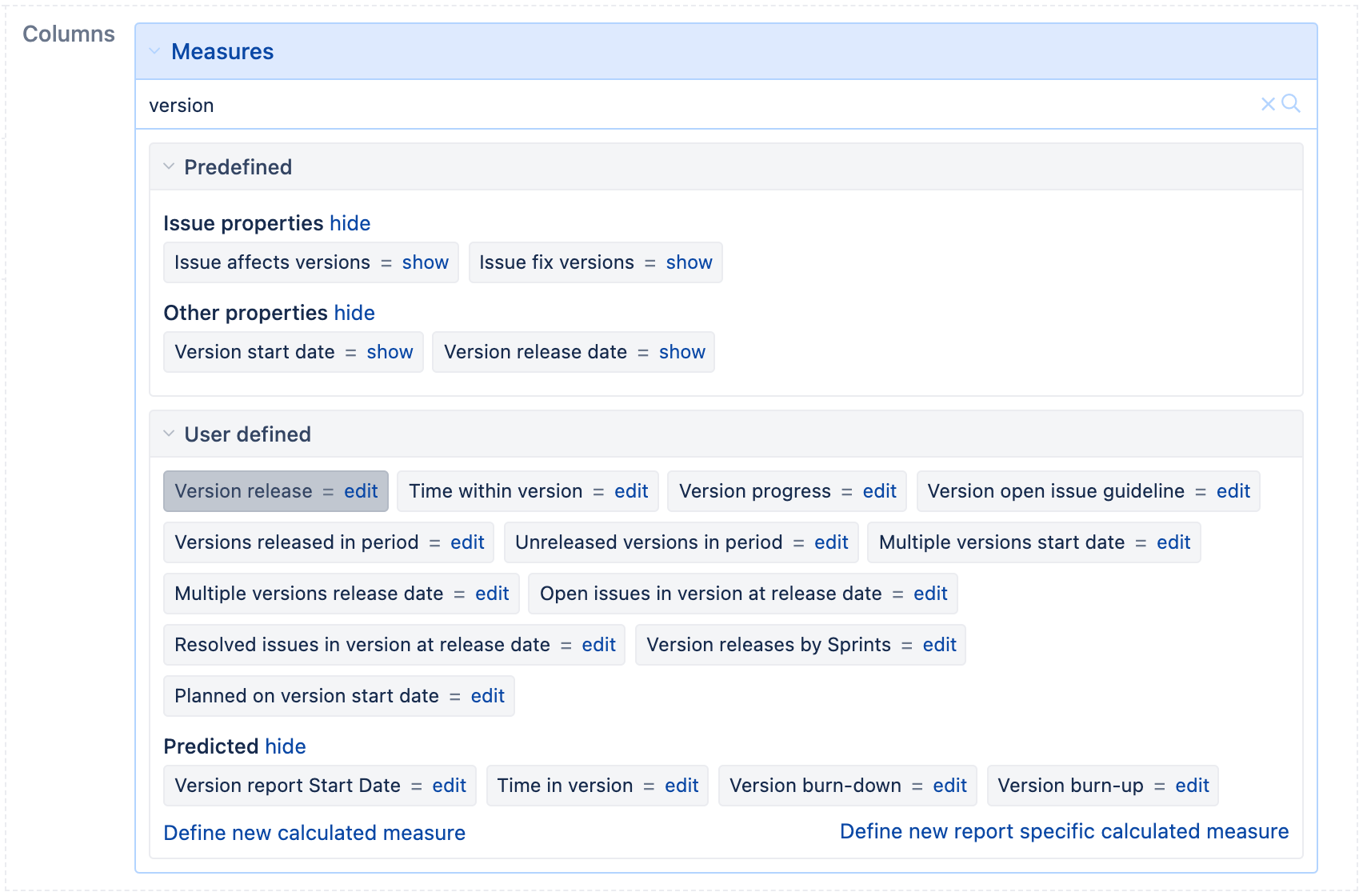
To add this data, expand the “Measures dimension”, search for “version” and select “Version release”.
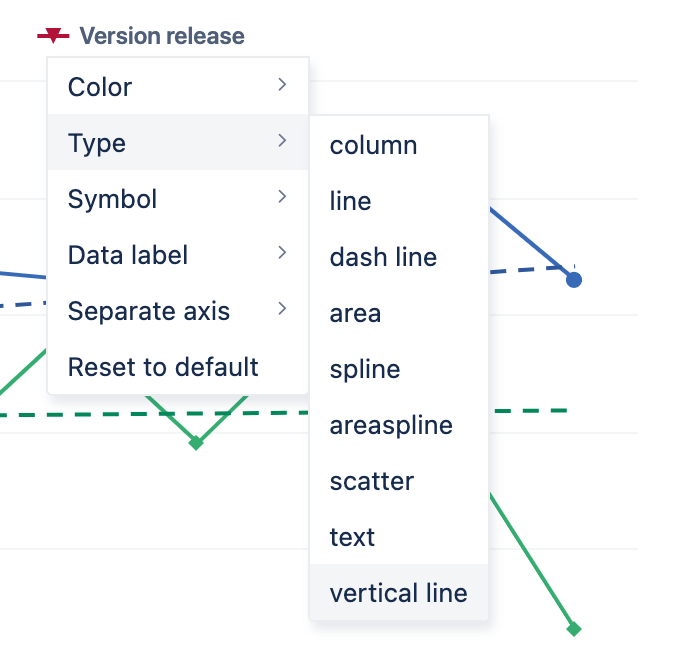
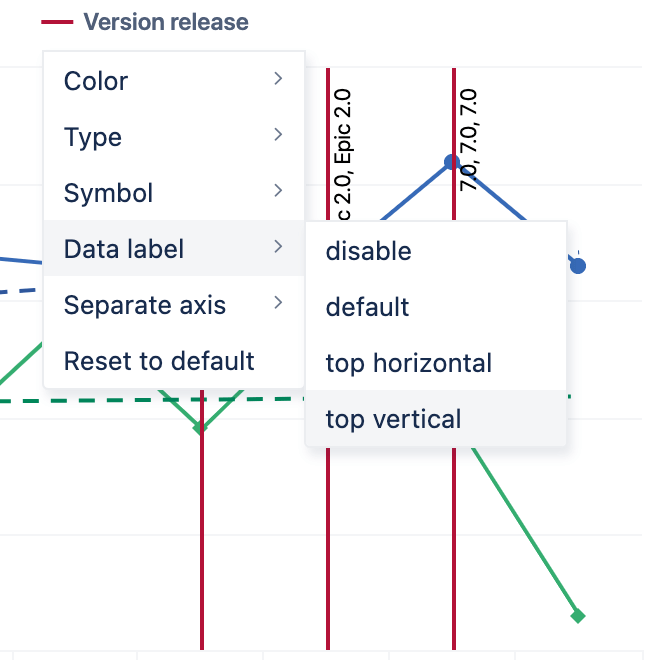
There are few chart configuration steps required to make our “version release dates” appear as vertical lines in our line charts:
- Click on the “Version release” color marker in the legend to open chart customization options.
- Select “Type” and change it to “Vertical line”.
- In the same chart options drop-down, select “Data label” and “top vertical” to show the version number on the vertical line.
I hope you’ll have a much deeper insight into what’s going on. Clearly, the number of closed issues often increases right before each release.
Sparklines and Heatmaps
Before closing this post, I just wanted to show you few more cool features you can use in your table and Gauge charts – the Sparklines and Heatmaps.
Sparklines
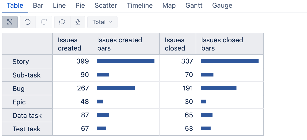
Sparklines are small charts within table cells. In this example, I’ll add little bars based on issues created and issues closed by issue type.
In any table, click on the measure name > “Add calculated” > “Sparklines” > “Bars”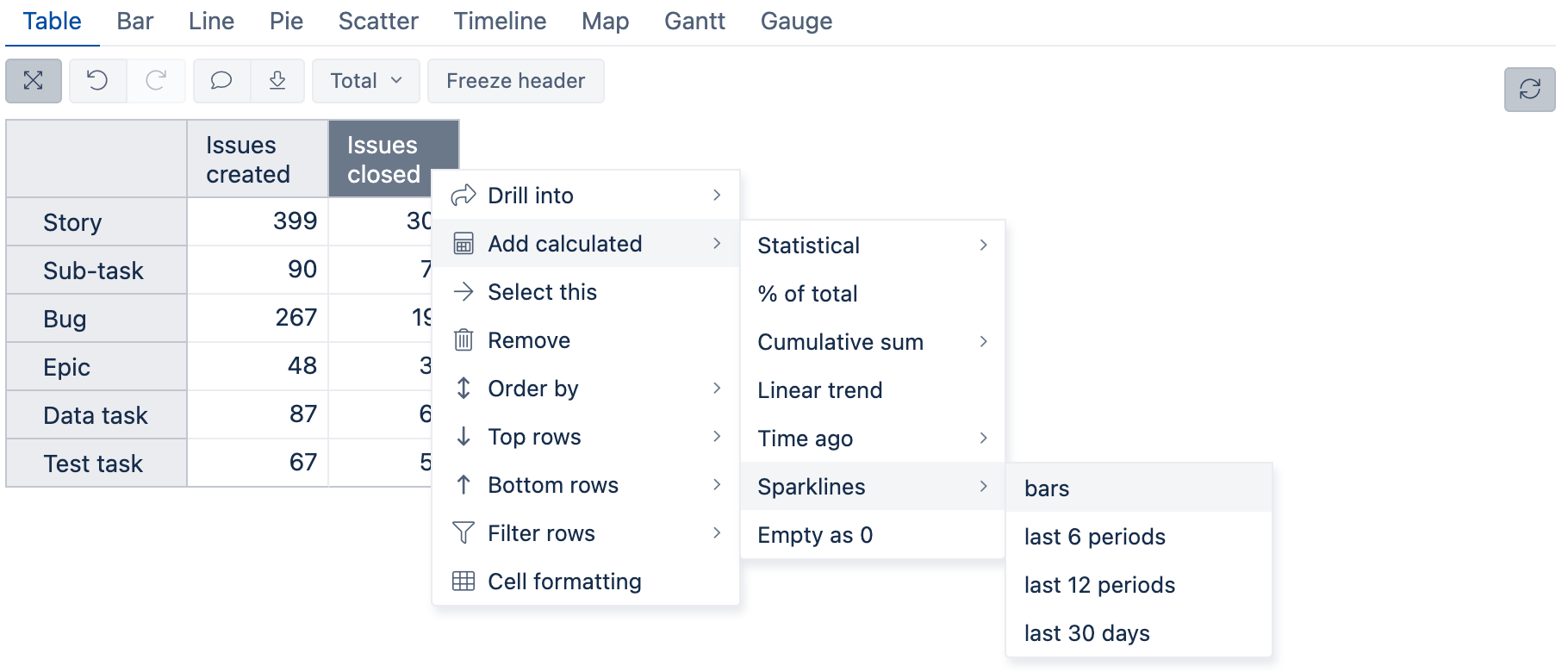
Drag-and-drop the “Issues created bars” column next to “Issues create and you’ll have something like this:
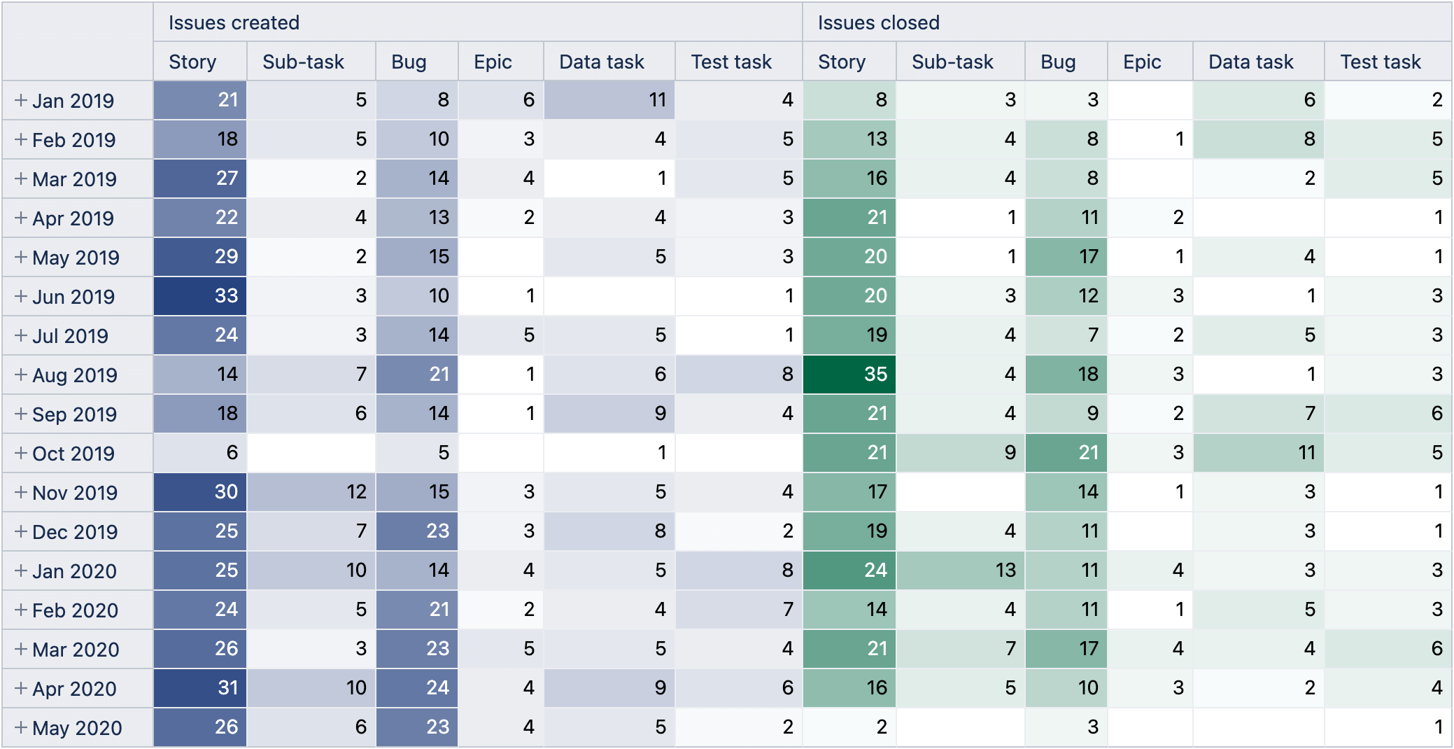
Heatmaps
Heatmaps is a form of conditional cell formatting. You can apply a color gradient to a column or the table based on cell values. Heatmaps will help you quickly see top and bottom values in bigger tables.
In this example, start from a fresh eazyBI playground report and drill into “Months”. The fastest way to do this is by clicking on the dimension column header and selecting “Month” level from "All hierarchy level members".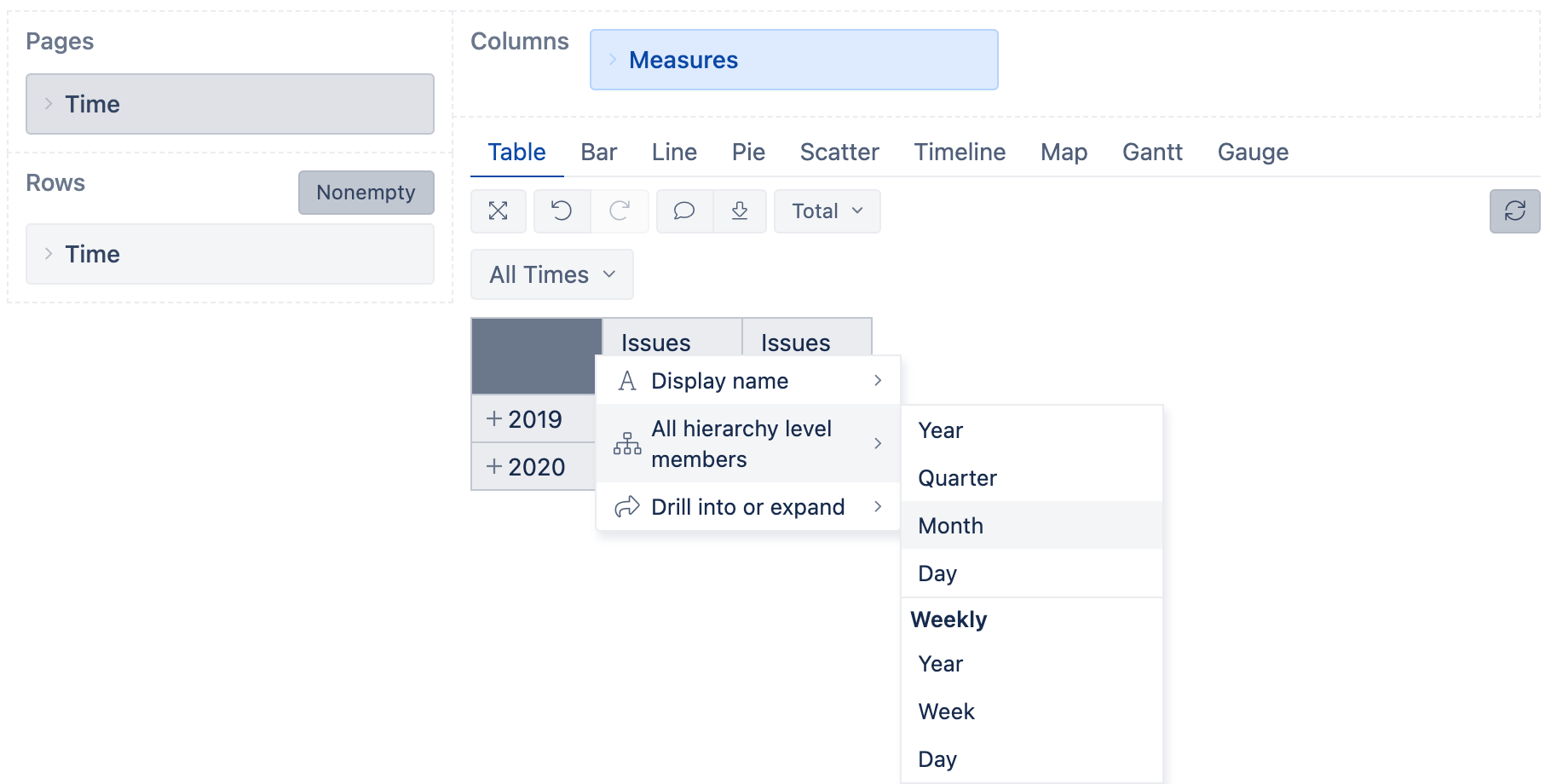
Add “Issue types” dimension in Columns after “Measures” and select to show all members at the “Issue type” level.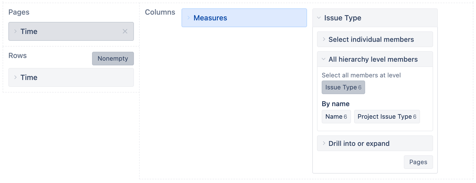
You should now have a multi-dimensional pivot table like below: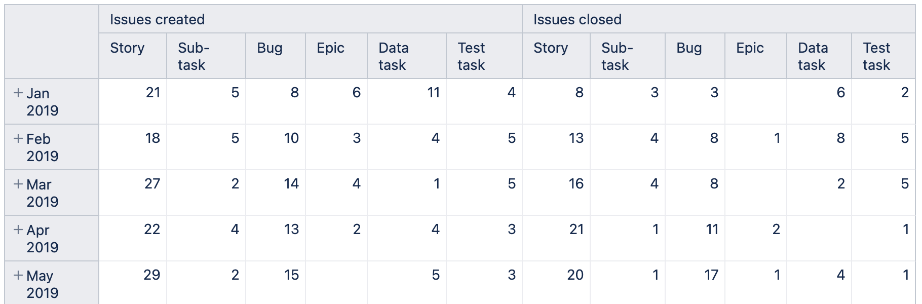
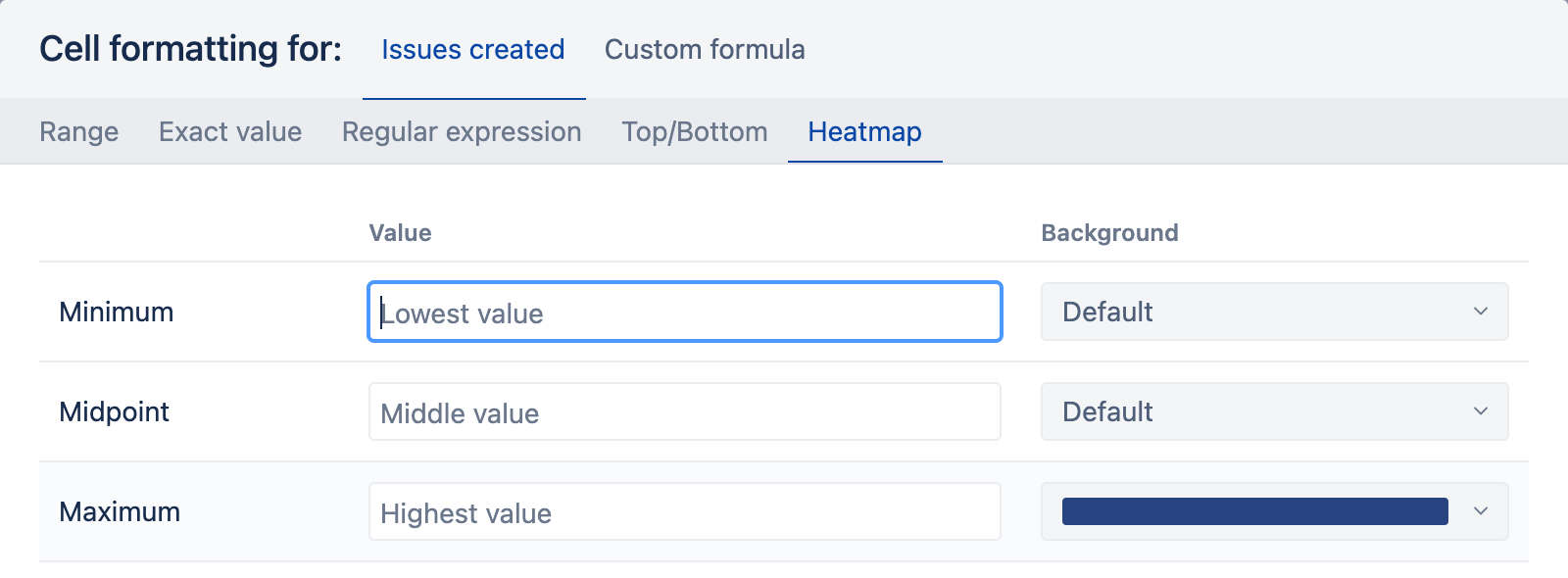
To add cell formatting, click on a “measure“ in the column and select “Cell formatting” from the context menu. Choose the “Heatmap” from the top menu and assign a color for the maximum value to get a gradient color coding from min to max value.
Do the same for Issues closed, only choose a green color for consistency. And here’s what you’ll get.
Learn more about Sparklines, Heatmaps, and other improvements in eazyBI 6.2.
Conclusion
In this article, we went over some first steps and the basic functionality of eazyBI for Jira. There is much more you can do.
Start a free 30-day eazyBI trial to explore your own Jira data, try different reports, add your own MDX calculations, save your reports, and create some dashboards.
In case of any struggles or questions, drop us an e-mail at support@eazybi.com, and we’ll help you out!